Hi there, so our mobile page for our corporate is good to go and working! However, up at the top right the little hamburger menu is not showing. I have the menu assigned, but not sure why this isn’t showing. Can you please advise how I can get that to show? Thank you
Hello Ashley,
Thanks for writing to us.
To help you with your concerns, we need to check the settings. Please share the exact page URL so we can check it on our end.
Thanks
the page is revealed.com/events/
each page is connected through our locations, and we need that menu up to show how to go back to each location.
Hello Ashley,
I checked the header, and it seems that there is no hamburger menu for small screens on the custom header.
Thanks
Hi there, How do I make that have a menu for smaller screens?
Hello Ashley,
In your Custom Header, add a Navigation Dropdown element, then go to its Customize tab. Under Hide During Breakpoints, select the desktop and laptop breakpoint icons so the element is hidden on larger displays and only visible on mobile screens.

Hope it helps
Thanks
I understand how to hide it from the larger screens, as I do that often. But how do I get the specific locations only menu that I created to be under the hamburger menu rather then all of the ones shown on our location pages.
Hello Ashley,
You can create a menu from the WordPress Dashboard -> Appearance -> Menu. Now you need to go to the Custom Header ->Navigation menu element->Menu tab->Setup->Menu->Select the created menu from the dropdown. Please ensure you have purged all the server cache and clear your browser cache and check it.

Thanks
Hi There, when I go to click on the magnifying glass for that locations only header it shows that there is nothing selected and I cannot get to where you are showing in this photo. What am I supposed to select in order to get this up.
Hello Ashley,
Please watch this video to learn how to select the menu in the custom header using the Navigation menu element.
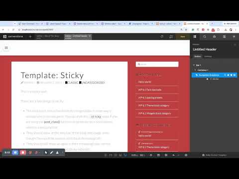
Hope it helps
Thanks