Hi! Can you please help with a CSS issue. I’m using X theme, latest versions of everything. I’m comparing two websites that I’m working on. Here are their mobile size menus: 
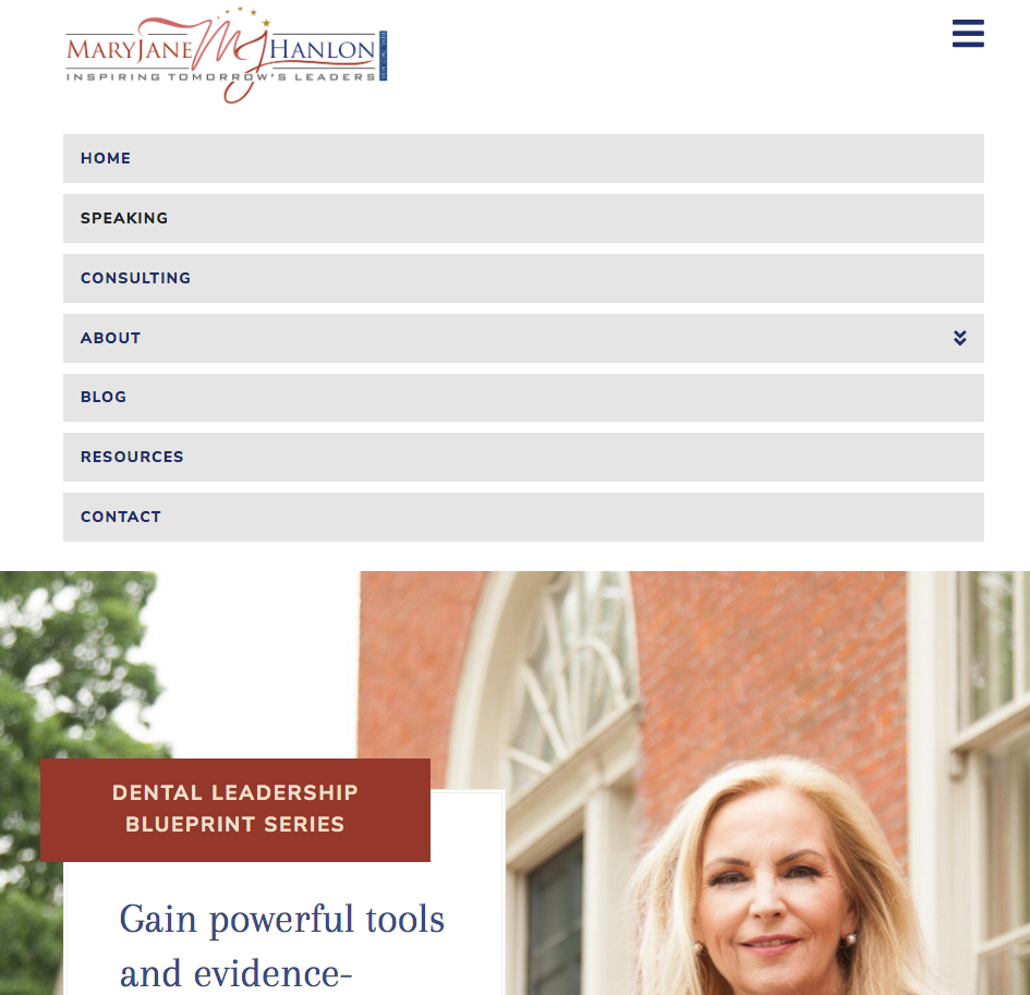
For the blue site, I customized CSS to make the navbar transparent so on desktop the menu “embeds” into the background image of the first section.
However, now the mobile menu doesn’t push the page content down anymore, when you open the menu. On the other screenshot, you can see that the “regular”, un-customized mobile menu does push the page content below it. I would like to achieve that on the blue site too. While keeping my other customization in place (for the transparent navbar etc).
What should I do to make the mobile menu push the content down when it’s open? And not show on top of the page content? (which makes it hard to read)
Thank you!