Mobile menu doesn’t work properly

Hi,

I have some problems with the mobile menu. I installed the plugin ubermenu to get the menu more responsive.

  • I have a problem with the scrolling down: First time I click on a menu item, the scroll is to high. The second time the scroll is correct. So you have to click twice before it is correct.
  • Is it possible that the mobile menu automatically collapses when opened, so the menu opens when you click on it and when you have clicked on a menu item the menu collapses again in stead of clicking on it. Now it stays open.

My url is: www.bytirsa.nl

Can you help me with that?
Thanks!
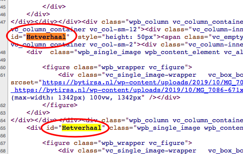
Hello @Donnyvdv,

Thanks for writing in!

I have inspected your page and I found this:

Please be advised than the element ID must be unique. There should be no duplicate IDs on a page. Please edit your page and add the ID to a Row or Content band container that must be unique.

For reference: https://www.w3schools.com/html/html_id.asp

Regards.

Thanks for the reply.

I am not sure if I understand what you mean. How can I add a ID to a row or content band so that it scrolls in one click correctly? This problems is for every page when you click on something the first time, after two clicks it scrolls correctly. First time is always incorrect.

And can you help me with the second question as well? Is it possible that the mobile menu automatically collapses when opened, so the menu opens when you click on it and when you have clicked on a menu item the menu collapses again in stead of clicking on it. Now it stays open.

I hope to hear from you. Thanks again!

Hi @Donnyvdv,

What Ruenel meant is make sure you only apply a unique ID per section/element, as you can see on his screenshot you have a couple of elements that have the same ID of Hetverhaal, so you need to correct that.

I can’t replicate the double-clicking issue though, can you test it on a different device and see if the issue is still happening, maybe that issue is devices specific as I see some issues with links need to be tap twice on some iOS devices.

Regretfully, your second request requires customization and we can not provide support with customization, in fact, the issue of your menu on mobile covering the content when expanded is because of your customization to force the navbar to be fixed top on mobile. The fixed top navbar in mobile is disabled intentionally so to avoid this kind of issue.

Thanks,

Okay! Thanks! I will try to fix what can be fixed. The double-clicking is indeed on apple devices, on desktop it is normal.

Thanks for the help!

You’re most welcome!

This topic was automatically closed 10 days after the last reply. New replies are no longer allowed.