Mobile menu bar

Hi,

Many here are reporting issues with mobile menu - that it is not switching to hamburger menu, etc.

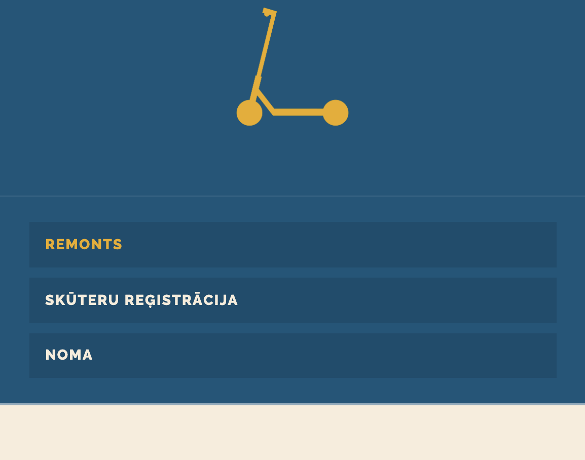
However my problem is the opposite - I want my menu to always be open (not turn to hamburger) on mobile. How can I do that?

My page - https://skuteruserviss.lv/

Hope someone can help me!

A
Hi @orgconfusion,

To achieve that, please add the following CSS under Theme Options > CSS:

a#x-btn-navbar {
    display: none;
}
@media (max-width: 979px){
    .x-nav-wrap.mobile.x-collapsed {
        display: block;
    }
}

Hope it helps :slight_smile:

Nice. Worked instantly!

Thank you and have a great day!

You’re welcome! :slight_smile:

This topic was automatically closed 10 days after the last reply. New replies are no longer allowed.