Hi there, is there a way to make the logo centred and above the ubermenu. I am trying to get the ubermenu to be centred and full width of the mobile screen with a dropdown menu. At the moment both appear on the same level.
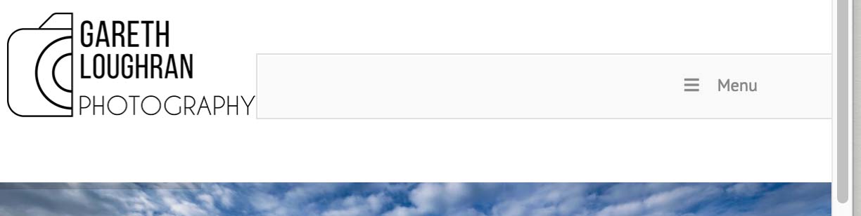
Hi there, is there a way to make the logo centred and above the ubermenu. I am trying to get the ubermenu to be centred and full width of the mobile screen with a dropdown menu. At the moment both appear on the same level.
Hi @tobyl
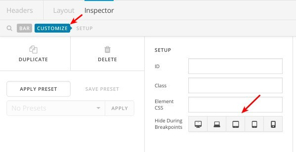
I suggest creating a new bar specifically for mobile devices, you can do that by clicking on “Customize” as in this screenshot:
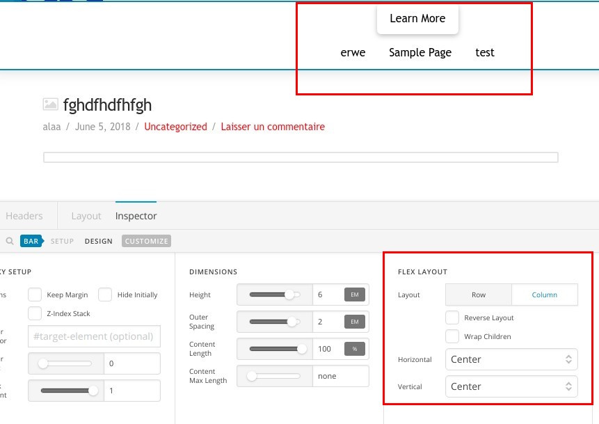
In this bar, make sure yo adjust the flex settings as following:
Thanks.
Perfect, will try that. thanks so much
You’re welcome!
We’re glad we were able to help you out.
This topic was automatically closed 10 days after the last reply. New replies are no longer allowed.