Mobile layout issues

Hi

Whilst developing a site i’ve been focusing on design for desktop and now when coming to configure for mobile i’ve encountered a few difficulties. Could anyone help me with the following issues without impacting on the desktop layout?

Site is http://lowcostamill.uk/wp

  1. Low Costa Mill should all be on the same line of text
  2. The phone number and dial code should be on the same line
  3. BOOK NOW just reads NOW
    I’m using Header>Misc>Topbar content area for this code
  4. The text is set to 1.4 however it’s far too small on the mobile version, can I increase text size for mobile only?
  5. At the foot of the home page, only two of the four widgets are displayed (facebook feed and Contact Us), three logos and a google map aren’t showing.

Any help would be appreciated!

Many thanks
Hi There,

  • Please try adding this custom CSS under Theme Options > CSS:
@media (max-width: 767px){
    .masthead-stacked .x-brand {
        font-size: 50px;
    }
}
  • Please update your topbar content to this:

<span style="font-size: 20px;"> <span>Tel: <a href="tel:01751472050">01751 472050</span> <a href="mailto:[email protected]">[email protected]</a> <a class="book-now" href="http://lowcostamill.uk/wp/index.php/bookings-availability/">BOOK NOW</a> <i class="fa fa-wifi" aria-hidden="true"></i> </span>

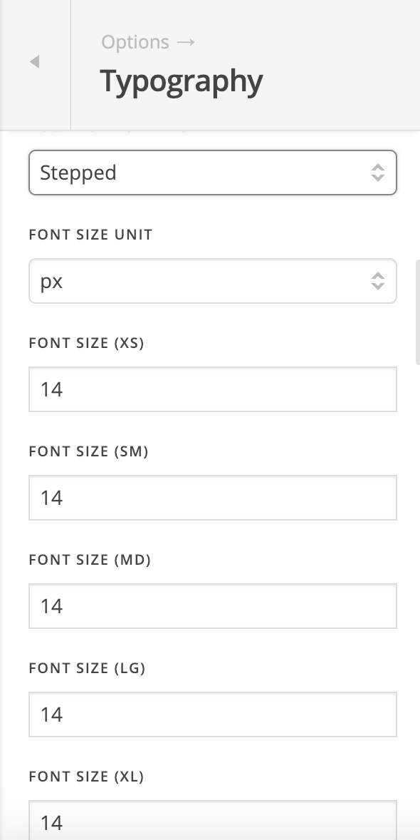
  • Please change the root font size of body to 14 under Theme Options > Typography > ROOT FONT SIZE:

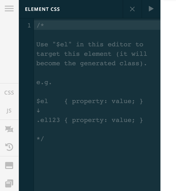
  • To fix this issue, please add this element CSS to the text element contains the images:
@media (max-width: 480px){
    $el img {
        float: none !important;
        display: inline-block;
    }
}

Hope it helps :slight_smile:

Thanks for the prompt reply! All good except i’m trying to get the BOOK NOW and Wi-Fi logo aligned right next to the social media icons without losing styling, without adding in spaces as that causes layout issues.

Is there an easier way of doing this? I’ve alligned right but it losing the style.

Thanks again

Hi Craig,

They aren’t going to align, the social media is outside the layout where top bar content is displayed. And it can’t be fixed by just CSS.

It’s doable and easy with Pro header builder and you can simply use flex layout to align them and add multiple elements like social and standard text.

Thanks!

1 Like

This topic was automatically closed 10 days after the last reply. New replies are no longer allowed.