Hello Brian,
I can see you have achieve centering it using margins. There’s another way that would make it center without using margins. Please try the following:
1.) Move the menu on first container. We need 1 container only. Delete the second container
2.) For this container, set the settings to this:
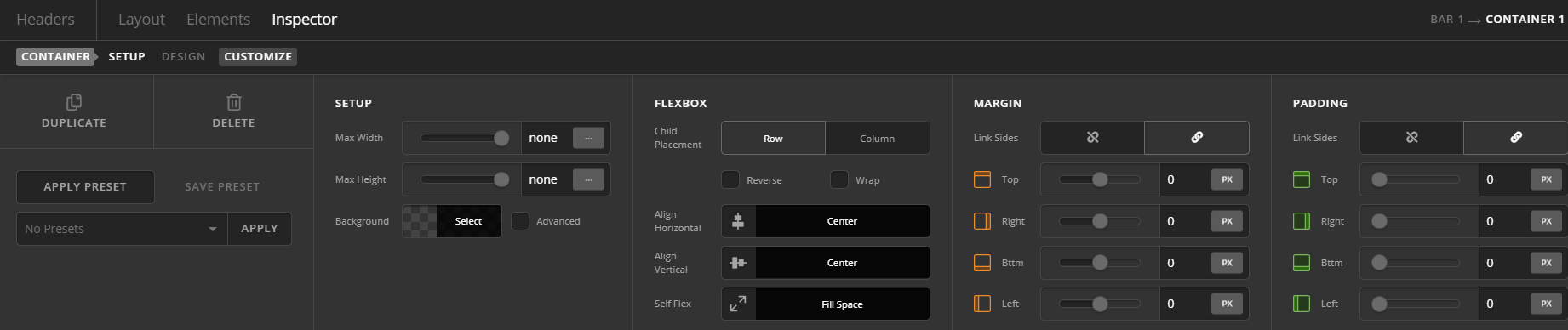
3.) Inspect the menu. Go to Customize tab > Element CSS> Add the following:
$el.x-anchor-toggle {
    position: absolute;
    right: 10px; /*Adjust accordingly. Position of the menu in relation to right side*/
}
Making it absolute in position means it is floating and not taking up actual space so it won’t interfer with the centering of the log. The logo will always be center because FLEX SETTINGS on columns without margins.
4.) Inspect the logo. Go to Customize tab > Element CSS> Add the following:
@media (max-width:480px){
$el.x-image img {
    max-width: 76%; /*Adjust accordingly to make sure logo will not overlap the menu*/
}
Hope this helps.


