Mobile hamburger menu alignment

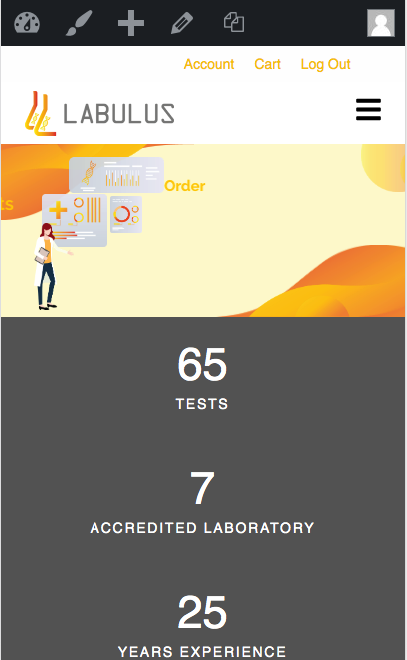
Hi, can anyone assist me on this issue when i view my website into tablet/ mobile view the menu automatically turn into hamburger menu…but the problem is i am not sure how i can make the menu to stack and align to the right and also how can i still show the hamburger menu icon when it is already click?

Website: labulus.com

p/s: for the hamburger menu i manage to find the css from the forum here

once click the hamburger menu, the menu become like as follow

Hi Dirah,

Thanks for reaching out.

Your site is behind a coming soon page, would you mind providing your login credentials in the secure note?

For the second screenshot, it shouldn’t appear like that. It’s a desktop menu, but I’ll check once I can login.

Thanks!

Thanks!

Hi im not sure if i did the correct way for the secure note. just to inform you my website encounter issue with the theme/cornerstone plugin awhile ago so i delete the theme from the file manager and just reinstall back and the css that i implement for the hamburger menu are gone. probably in an hour or so i think ill be able to get it back

Hello @Dirahh,

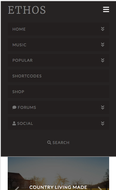
You are using Ethos stack and this is how the mobile menu looks like in smaller screens:

When I checked your site, the menu looks like the same already which is aligned to the right:

The mobile menu and the desktop menu looks differently. In mobile menu, the menu items were stacked below each other because there isn’t enough space if you have them inline.

Hope this helps.

This topic was automatically closed 10 days after the last reply. New replies are no longer allowed.