Mobile Hamburger Menu Alignment Issue

Hi All.

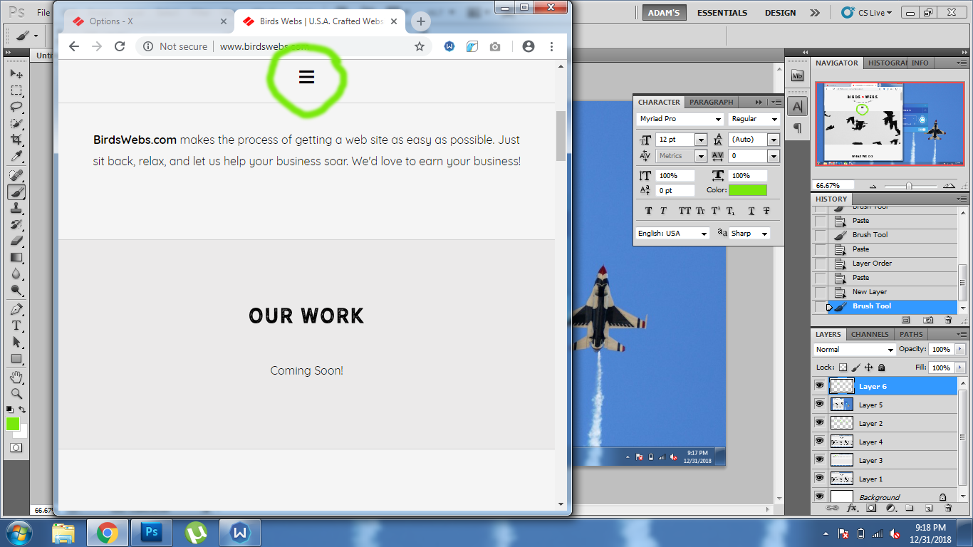
My Hamburger menu looks great on mobile devices, until users scroll and the Hamburger menu is displayed in the fixed mobile navigation menu. When the fixed navigation appears, the Hamburger icon is not vertically centered. How can I fix this to where the hamburger icon vertically aligns ONLY on the FIXED navigation mobile menu? I have included and image to show what I am talking about. Thanks in advance!!
Hi There,

Please add the following CSS under Theme Options > CSS:

@media (max-width: 979px){
    .x-navbar.x-navbar-fixed-top .x-btn-navbar {
        margin-top: 20px;
    }
}

Hope it helps :slight_smile:

Works like a dream! Thank you all for your wonderful support!! THANKS!!!

Glad we were able to help :slight_smile:

This topic was automatically closed 10 days after the last reply. New replies are no longer allowed.