Mobile display challenge with a Layer Slider

I am having difficulty getting a Layer Slider to be visible in a test page (https://boakart.com/home-test/) when the page is viewed in iOS on a phone.

Held portrait, there is nothing of the slider viewable; when held landscape I see a little bit of the bottom of the slider.

In iOS on an iPad everything is fine.

Any thoughts on how I might make the slider visible?
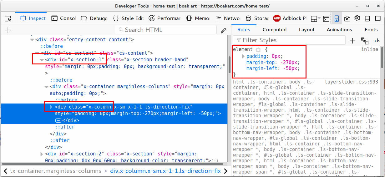
Hi johnboak,

I’ve checked your website and I can see a negative margin value was added to the first column in the first section in the page, please check this screenshot:

Could you please remove this negative margin and recheck this issue? you can do that from here:

Thanks.

I removed that CSS from the “home-test” page and it has no effect. I notice that the mobile-simulation for “480px & smaller” makes it display just fine.

Hello There,

To resolve your issue, please edit your page back in Cornerstone and insert the following custom css in the settings tab, Settings > Custom CSS

.x-column.x-sm.x-1-1.ls-direction-fix {
    margin-top: 0 !important;
    margin-left: 0 !important;
}

Hope this helps. Kindly let us know.

This works.

When I add the CSS via the Cornerstone CSS Input, is it specific to that page? Or does it join some common pool of CSS specific to my child theme?

Thanks!

Hello @johnboak,

Thanks for updating the thread.

CSS added under Cornerstone page CSS is specific to the page in question and changes won’t effect other pages.

Thanks.

That concludes this inquiry. Thanks for your help!

You are most welcome. :slight_smile:

This topic was automatically closed 10 days after the last reply. New replies are no longer allowed.