Hi @ShaunCoward,
Yes, it’s like contradicting setup, I tried some workaround but not working since the entire layout is in flex.
What you could do is upload a smaller image (smaller than 250px). Then utilize the HIDE DURING BREAK POINTS option in your header bar or container(or any element).
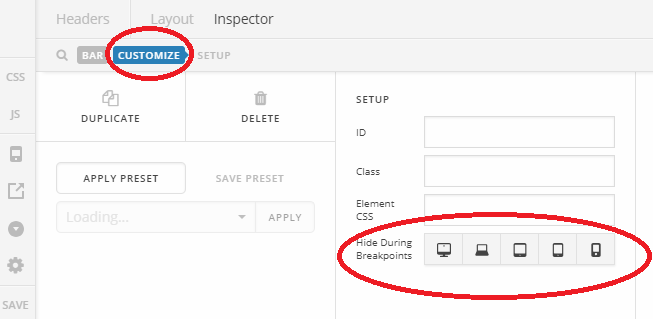
Example, you can have multiple header or container, and each has a different layout. A header/container for desktop contains inline images, while header/container in tablet and mobile has stacked and smaller images.
Then simply hide the desktop header/container from mobile, then hide the tablet/mobile header/container from desktop. you can’t have the same header bar across devices especially the screen width takes smaller and smaller, hence, needing a different layout.
Thanks!

