Hi there,
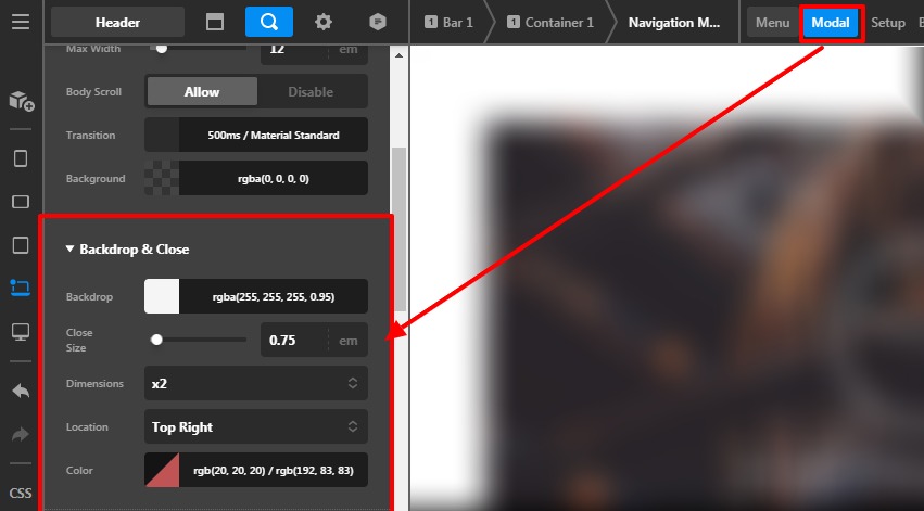
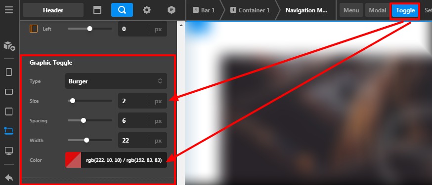
One of the most annoying things for me with X/Pro is the implementation of Menu Toggle and Close Buttons and their configurations.
See: https://www.loom.com/share/6e74e6b6fde847e8a540c3772ca00c9d
I really hope this is improved in the future to have a more coherent flow.
In the meantime, what is the solution to “match up” both buttons in terms of style/size/placement - so the result is no mouse movement needed to toggle between both.
Note: Using ‘osborne-optics’ Header from Design Cloud.
Thanks!