http://reachingforrainbows.com
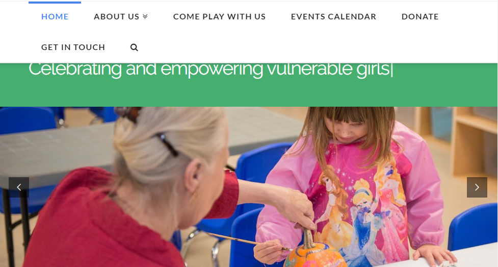
I need the menu to go to mobile/hamburger earlier, to avoid its breaking up into two lines (see screenshot).
http://reachingforrainbows.com
I need the menu to go to mobile/hamburger earlier, to avoid its breaking up into two lines (see screenshot).
Hi There,
Please add the following CSS under Customizer > Custom > Global CSS:
@media (max-width: 1100px){
.x-nav-wrap.desktop {
    display: none;
}
.x-nav-wrap.mobile.in,
.x-nav-wrap.mobile {
    display: block !important;
}

a.x-btn-navbar {
    display: block;
    width: 60px;
}
}
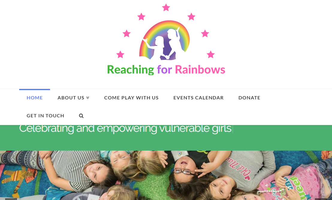
Thanks. I added the CSS but I still have the same problem.
Hi There,
Please try changing the custom CSS to this:
@media (max-width: 1200px){
.x-nav-wrap.desktop {
    display: none;
}
.x-nav-wrap.mobile.in,
.x-nav-wrap.mobile {
    display: block !important;
}

a.x-btn-navbar {
    display: block;
    width: 60px;
}
}
Hope it helps 
This topic was automatically closed 10 days after the last reply. New replies are no longer allowed.