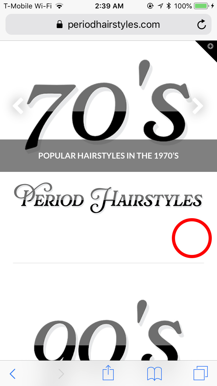
I just installed the theme not so long ago. For some reason, the color I chose for the navigation background is not reflected on mobile, it only changes on desktop. Furthermore, the hamburger menu on mobile is there but it’s transparent/white. Tried using multiple css I’ve seen on the forum but it only affects desktop not mobile. Am I doing something wrong? In the picture, the red circle indicates where the hamburger menu is at but it looks totally different form my preview on desktop set to a mobile screen. Furthermore, my logo and menu is aligned on the desktop but it’s not aligned on mobile. Please help!
hi There,
Thanks for writing in!
Can you please try this CSS and let us know if that works?
You can paste this CSS to your Theme Option -> Global CSS
@media (max-width: 979px) {
.masthead-inline .x-btn-navbar {
    display: inline-block;
    float: none !important;
    color: #666 !important;
    margin: auto !important;
}
.x-navbar-inner .x-container.max {
 text-align: center;
}
}
Hope this helps!
This topic was automatically closed 10 days after the last reply. New replies are no longer allowed.