Menu on mobile devices with a background

Hi,
I’m finishing the website I created using Renew, and the Church template. (www.igrejalifepoint.com)
The menu on my desktop looks perfect but using mobile devices is a mess, because when I click the button, the menu drops upon the slider I have and is covering the slider text. I have two problems:

  1. One, I have a video on my slider (home) and the video is not running on devices. Is there possible to run the video exactly I see at www.elevationchurch.org?

  2. Two, is there possible to have a background when the menu drops, exactly as we can see in the website mention on item 1?

Consideration that I really don’t know what to do with this menu dropping covering the slider revolution on mobile devices if I can have the menu with a background will be very nive.

Many, many thanks,
Giovana Marques
Hi There,

1.) I can see you are using revslider. Please check this: https://www.themepunch.com/faq/video-not-showing-up-on-mobile/

2.) This issue is because of the following custom CSS:

  .x-navbar {
    background-color: rgba(0,0,0,0) !important;
    position: absolute;
    width: 100%;
  }

That CSS makes the navbar on top of the slider even on mobile. If that is your intention, then we can add this custom CSS to add background:

  @media (max-width: 979px){
    .x-nav-wrap.mobile.collapse.in {
         background: red; /*Change red to your preferred background color*/
         padding: 10px;
    }
    }

Hope this helps.

Lely, thanks for the excellent assistance as usual. You guys are the best!
In reference of the item 1 I will try to solve the issue and if I can’t fix it, I will send another message to you.
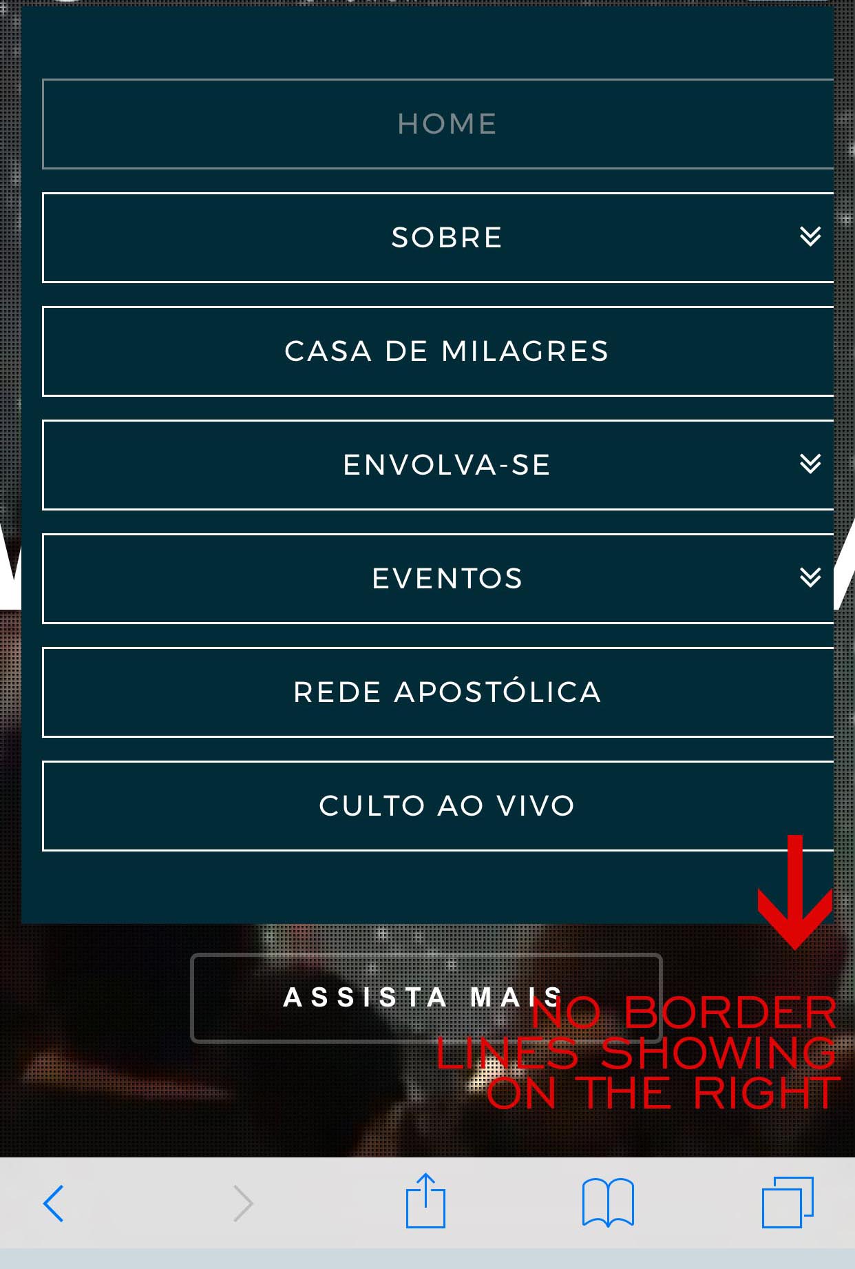
For the second issue, I added the code you suggested and worked beautifully but I was wondering if there’s a possibility to decrease the width of the boxes around the menu items. As you can see in the picture attached the boxes are bigger than the screen and the right side borders are going out of the screen. Is there anyway to fix this?
Many, many thanks!
Giovana Bartholazzi Marques

Hi there,
In reference of the issue number 1 the video inserted as a main background on Home slider (first slider) is running just on desktop computers as explained on the forum. But when I insert the video as a Content Layer the video is still not running on mobile devices.
Please help…
Giovana Bartholazzi Marques

Hi there,

For the second issue, please add this CSS as well

.x-navbar .mobile .x-nav {
    -webkit-margin-after: 0;
    -webkit-margin-before: 0;
}

About the video issue, it should play but the user should interact with it. Like tapping to play it, and you can’t do that since the video is covered by other elements, like the dots pattern. Is this about a video, how about a normal section with added video within it? Unfortunately, there is a limitation with the slider.

Plus, in your given sample, it’s a GIF and not a video http://elevationchurch.org/wp-content/uploads/2017/07/2017_July09_HollyPreRecord_JustAGirl_ECdotOrg-GIF.gif

Thanks!

Hi Iam, thank you so much for the explanation about the video on revslider. I’ll try to use a gif instead of a mp4 file to have the video running on all devices with no problem. Regarding the code to keep the menu inside the screen of the mobile devices, unfortunately the menu option boxes are not completely inside the screen yet. I added the code but nothing changed, when you click the menu button the menu drops down but the boxes around the items are not showing inside the screen completely as the file I sent to you. Please advice, many thanks! You guys are awesome!
Giovana Marques

Hi Giovana,

Can you try to clear cache on your mobile browser? It is not overflowing when I check on my mobile and it display fine already. See below:

This topic was automatically closed 10 days after the last reply. New replies are no longer allowed.