Menu breakpoints

Hi, on our clients website (details included in secure note). We want to alter the breakpoints on the menu so it never drops to two lines. On different screen sizes, the cart and other menu items are dropping to line two before the burger menu breakpoint takes over. We would like to force fullwidth single line for the menu for as long as feasible, and then revert to burger menu straight away (i.e. without ever dropping to two menu lines). Please advise.

Thank you
1 Like

Hi Morelly,

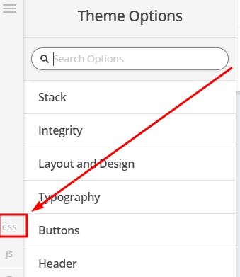
To achieve that, you can add the code below in Theme Options > CSS

@media (max-width: 1545px) {
.masthead-stacked .x-navbar {
    text-align: center;
}
.masthead-stacked .x-btn-navbar {
    display: inline-block;
}

.x-nav-wrap.desktop {
    display: none;
}

.x-nav-wrap.mobile {
    display: block;
}


.x-nav-wrap.mobile.x-collapsed {
    display: none;
}
}

Hope that helps

This topic was automatically closed 10 days after the last reply. New replies are no longer allowed.