hello,
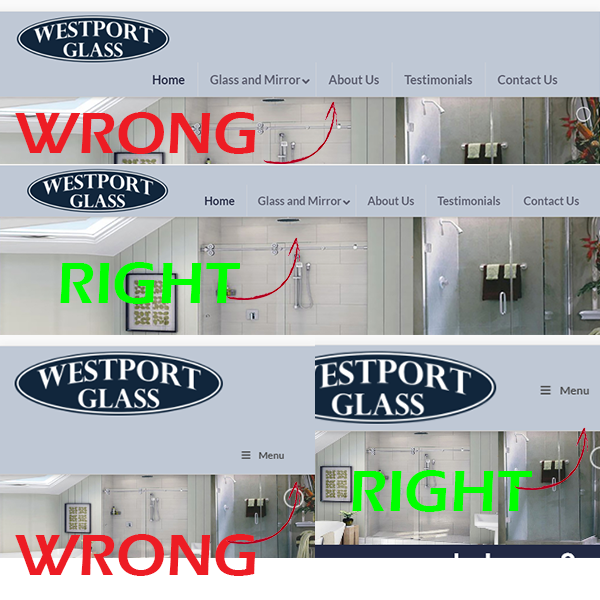
at certain page widths, my menu bar will go below my header image. Is there an alternative method to this happening? I do not like the look of the extra space when it shifts down. thanks. I will include my website in a secure note.
hello,
at certain page widths, my menu bar will go below my header image. Is there an alternative method to this happening? I do not like the look of the extra space when it shifts down. thanks. I will include my website in a secure note.
Hi,
You can adjust your menu breakpoint in General Settings > Responsoive & Mobile.
Try adding 1080

Then add this in Theme Options > CSS
@media(max-width:480px) {
.x-brand img {
    width: 200px;
}
}
Hope that helps
that worked! thanks!
You’re welcome! 
This topic was automatically closed 10 days after the last reply. New replies are no longer allowed.