Menu Bar Issue

The menu on my site works fine, until I decrease the size.

In other words, the desktop menu works, and the mobile menu works, but there’s an in-between size where the text drops beneath menu bar.

If you slowly decrease the size, you’ll see what I mean:
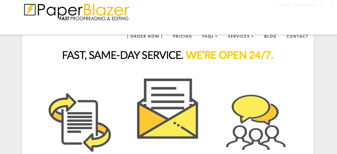
Here you’ll see the text that drops beneath.

Hey @jupebox,

There are 3 options you can edit in order to fix that.

  1. Decrease your Logo Width in Appearance > Theme Options > Header > Logo - Image
  2. Decrease your Navbar Top Link Spacing in the Appearance > Theme Options > Header > Links – Alignment
  3. Increase your Site Max Width in Theme Options > Layout and Design.

Hope that helps.

1 Like

Hey, @christian_y. I am having the same issue that @jupebox is reporting and makes me wonder if there’s a way to control the width at which the inline menu is reactively converted into the mobile button.

In a way, what’s happening is that the inline menu is “waiting” for a minimum screen size that is below its own width, so it has to be shifted to the next available vertical space.

Do you know where we can control this?

1 Like

Hi There,

Please provide your URL so we can guide you.

Thanks!

This topic was automatically closed 10 days after the last reply. New replies are no longer allowed.