@media (Width) errors

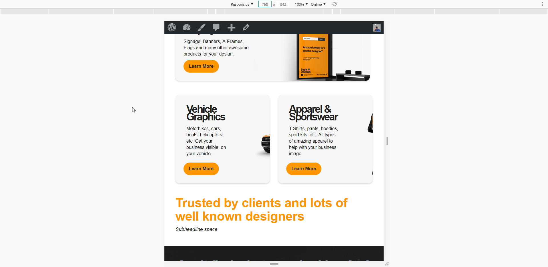
Hi, I am trying to repoisition my background images at certain widths, so at certain widths they adjust position

I get little anomalies of it jumping.

I was trying to use “%” and “VW” constraints, but VW attaches it to the edge of page. I am hoping to have the image attached the the Right Side and 40% in . (The text is max width of 65%). trying to get the image in the other 35% without it going over the text.


Im trying the Code:

@media(min-width: 1200px){
  $el .x-bg-layer-lower-image{
   background-position: left 225px top 50% !important;
  }
}

@media(max-width: 768px){
  $el .x-bg-layer-lower-image{
   background-position: left 150px top 50% !important;
  }
}

This does not adjust throughout the width.
Is there a way to get these to transition between the widths?
(I also tried the code without min-width and max-widths)

Trying to Transition the image between 1200px - 768px
and then new Position for 767px - 480px

Hi Moleman,

Thanks for writing in!

To make changes between the width you can use this media query.
Please try this and let us know!

@media(max-width: 1200px){
  $el .x-bg-layer-lower-image{
   background-position: left 225px top 50% !important;
  }
}

@media(min-width: 768px){
  $el .x-bg-layer-lower-image{
   background-position: left 150px top 50% !important;
  }
}

Hope this works!

Unfortuntely not. the min-width rule cancels out the Max-width rule.

View Vehicle Graphics column
As you can see we can set the 1200px to be correct.

But it continues as you width changes

Hi Guys,

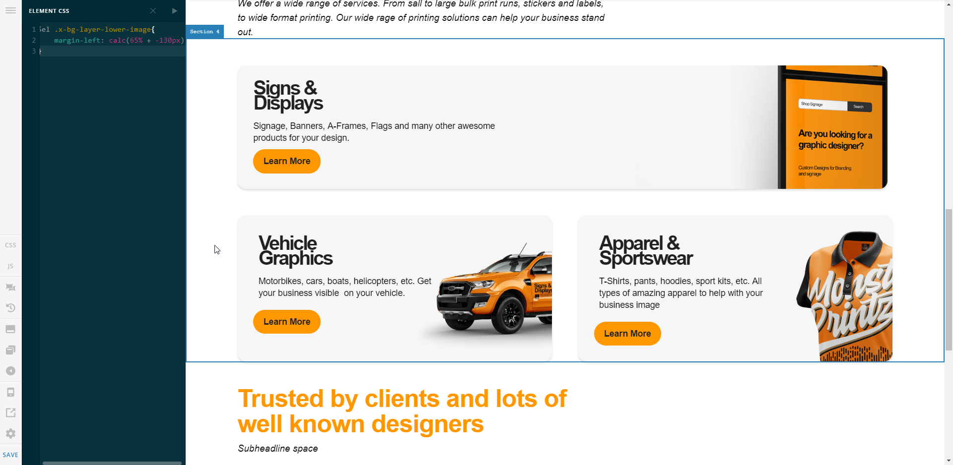
I manage to work something out
Re thought my process and managed to move the background image margin across.

margin-left: calc(65% + <Image-offset>px)

https://photos.google.com/search/tra/photo/AF1QipNTN8F_buVijZIUjmlCfJQP6m56ZatbZJ2g4A0b

Glad to know that!

Thanks

This topic was automatically closed 10 days after the last reply. New replies are no longer allowed.