Masthead/Navbar Padding for Blog and Portfolio main page

Good day,

I want to add spacing between the masthead/Navbar and the title of the main blog and portfolio pages, as well as the individual post pages. I tried to use the following code suggested elsewhere: .masthead { padding-bottom: 65px; } but the padding disappears as soon as I start scrolling. Image shows where I want space:


What appears to happen is that the blog and portfolio pages do not begin after the masthead/navbar, because if I add sufficient padding to the masthead using above CSS I can see the separator line before the page title. Maybe the answer is to get these pages to start below the masthead/navbar rather than the very top of the page. So my questions are:

  1. How to make blog and portfolio pages begin below the masthead/navbar (preferably) OR

  2. Provide a way to pad the pages so that the title is not so close to my logo

  3. Also, how can I center the title on the page rather than left justified?

Thank you for your help

I just found that this only seems to be happening on the desktop. Mobile seems to display fine with both the top and bottom title separator on the blog and portfolio main pages.

I would still like to have a little padding at the top as the separator is right up against my logo.

Hello There,

Thanks for writing in!

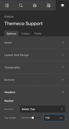
To resolve your issue, please go to Cornerstone > Theme Options > Headers > Navbar and make sure to set your “Top Height” to 110 pixels instead of 50.

Best Regards.

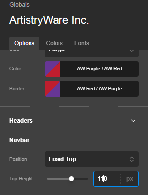
Unfortunately that did not help. Here I changed the suggested setting:
image
I did manage to get the desktop to show the blog and portfolio pages correctly. I forgot to set the logo text as hidden. My bad, sorry. Now on both the desktop and the mobile it shows the title top separator right below the logo. On the other pages such as home, about and contact, the suggested setting does provide additional space between the first section and the navbar, but it disappears as soon as I start scrolling.

I still need to adjust the gap between the top separator and the logo, and the suggested setting does not do this.

Any help would be greatly appreciated.

Hi @GregoryArndt,

I have checked the page and found the logo is in full width and the *** Hamburger** menu shifted under the logo. I would suggest you adjust the logo size and check if that resolves your problem or not. If not, please provide login credentials for your site in a secure note to examine the settings further, including:

– WordPress Site URL & Login URL
– WordPress Admin username/password

To create a secure note, click the key icon underneath any of your posts.

Thanks

Hi @tristup,

Thank you for checking. I think I figured it out while waiting for another reply. but if you would like to check the site I’d be happy to share the Themeco login creds I created.

Hi @GregoryArndt,

Glad to know that you are able to figure it out.

Thanks

This topic was automatically closed 10 days after the last reply. New replies are no longer allowed.