Would like the margin of my body text to line on big screens with the first column of the footer text. Tried it with using ‘indent’ in css.
But on mobile the margin of course also shifts to the right; thats not what I want.
So, how can I get different margins for the body text on different screens.
Hope you understand.
Hi There,
Please provide the password so we can take a look.
Thanks!
Sorry.
I have disabled the under construction page.
Hope you can get in now.
Hi There,
Thank you, but sorry I am not entirely certain of what you’re trying to do, please clarify.
Are you referring to this section? https://prnt.sc/go6hch
If so, please enable the ROW’s column container option of that section and make it a 4 1/4 columns.
Then use that image on the left as a border-image, not as a content.
That should align that section with the others.
Hope it helps,
Cheers!
In this case you adjust the footer to the body text.
Can you please provide me with the code to use for the border image? And tell me where to place it?
Only see examples with image around element.
Is it also possible to adjust the body margin so it aligns the second column in the five-column footer?
I would prefer that option.
Thanks
So a solution without a column container and a different indent for mobile and desktop…
Hi there,
I suggest that you take the steps below:
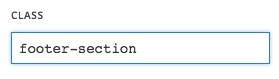
- Add a class name for your footer section to be able to access it via CSS. For example:
footer-section:
-
Make the section to have the container exactly like what you have done in the body columns.
-
Change the footer from 5 column mode to 4 column mode and remove the column which contains the image.
-
Go to X > Launch > Options > CSS and add the code below:
.footer-section {
	background: url(https://ondernap.nl/wp-content/uploads/2017/09/maatverdeling-footer-1.jpg) no-repeat hsl(188, 55%, 58%) left center;
    background-size: contain;
}
The code above will add the image as a background to the footer section and set it to show at the very left of the section and force it to show the whole image.
In general please always consider that decorative stuff should go as a background and not the img tag.
Another alternative way is to use the background functionality of the section itself:
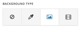
On that case, the CSS will change to:
.footer-section {
	background-position: left center;
	background-repeat: no-repeat;
	background-color: hsl(188, 55%, 58%);
    background-size: contain;
}
Thank you.
Hi Christopher
That works just fine.
Thanks for this clear explanation.
Tjeerd
A next question arises.
How can I put the dots in the body text summaries left from the main margin and the text itself starting on the margin. So, a tab or something like that.
On mobile and on desktop of course…
Hi,
You can use html list instead of paragraphs.
eg.
<ul style="list-style-position: outside;margin-left: 0px;">
<li>Vertaalt weerbarstige vraagstukken naar werkbare oplossingen.</li>
<li>Verbindt ‘wat heb ik te bieden’ met ‘wat heeft de organisatie nodig’.</li>
<li>Verleidt mensen om regie en verantwoordelijkheid te nemen.</li>
<li>Versterkt eigenaarschap en betrokkenheid.</li>
</ul>
Hope that helps.