Maps styling

Hi there,

I have an embedded google maps on this page:

https://www.hotelnoble.hu/home/

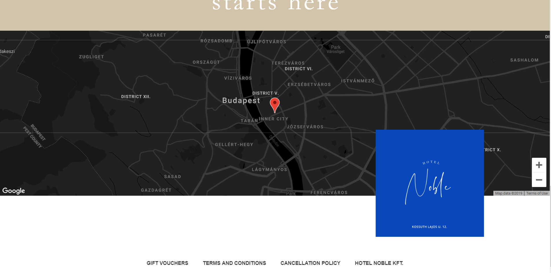
I’m using your latest element so that I can use json styling. The thing is, if I set it up, it takes up a lot of space (basically one full screen), so I set the max-height to 500px. Which is great, but now there’s something weird going on.

There’s some space under the maps container, which goes as far as below the footer. Why is this and how can it be fixed?

Thanks!
Hello @Pbalazs89,

Below is what I am seeing. It seems correct based on your settings. No unusual space below the footer. Please clarify the issue.

Hi there,

I managed to fix it on the desktop version, but when I created a map on mobile, it is just way to small.
I tried adding a min-height, but that ruins it, it only adds a gap under it. How can this be fixed?

https://www.hotelnoble.hu/ (bottom of the screen, mobile layout)

Thanks!

Hi @Pbalazs89,

You can try adding the code below in Cornerstone > CSS

@media(max-width:767px)  {
.x-frame-map-google .x-frame-inner {
        padding-bottom: 50% !important;
}
}

Change 50% to adjust.

Hope that helps

Thanks, that did the trick!

You’re welcome.

This topic was automatically closed 10 days after the last reply. New replies are no longer allowed.