I added Google maps to my website but the layout does not look good on a mobile device. 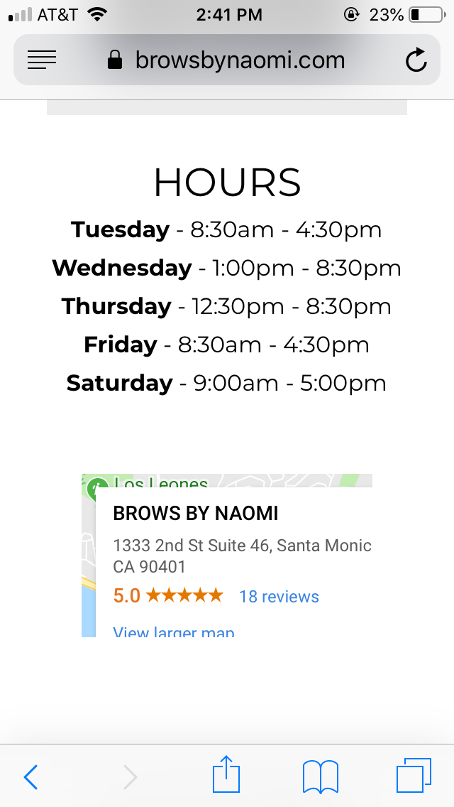
I even tried this code and it still did not work.
@media screen and (max-width: 580px) {
.x-map .x-map-inner {
padding-bottom: 100%;
}
}
I added Google maps to my website but the layout does not look good on a mobile device.
I even tried this code and it still did not work.
@media screen and (max-width: 580px) {
.x-map .x-map-inner {
padding-bottom: 100%;
}
}
Hi Sasan,
Thank you for reaching out to us. Try this code instead:
@media screen and (max-width: 580px) {
    .x-frame-map-embed .x-frame-inner {
        padding-bottom: 100% !important;
    }
}
To make it better please turn off the Inner Container of the Row that contains the map:
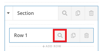
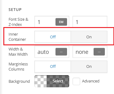
Don’t forget to clear all caches including your browser’s cache after adding the code to see the changes right away on the front-end. Let us know how this goes!
Hello,
Yes, I made the changes added the new code but still looks the same on a mobile device.
Hi Sasan,
Could you try changing the 580px to 768px?
Though, it may not really work well due to spacing, it has no enough width to even render the map information. I recommend setting the padding or margin of the map or its container. Right now, I don’t see any map so I assume you temporarily removed it.
Thanks!
This topic was automatically closed 10 days after the last reply. New replies are no longer allowed.