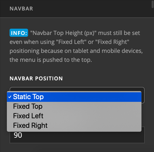
I want my entire page to scroll like this website so that the navigation bar is not always visible https://mommyonpurpose.com
My website is https://blogbymichelle.com

There are all the codes I have in CSS
.x-brand img {
width: auto !important;
}
.x-navbar,
.entry-wrap,
.simple-social-icons ul,
.x-colophon.bottom{
border:none;
box-shadow:none;
-webkit-box-shadow:none;
-moz-box-shadow:none;
}
.x-colophon.top, .x-colophon.bottom {
border-top: 1px solid rgba(0,0,0,0.085) !important;
box-shadow: inset 0 1px 0 0 rgba(255,255,255,0.8) !important;
}
.blog .x-header-landmark {
display: none;
}
.blog .x-main article:first-child .entry-wrap {
padding-top: 0;
}
.x-container.offset {
margin-top: 6em;
}
.blog .entry-title {
font-size: 185%;
}
.single-post h1.entry-title{
font-size: 185%; /* Adjust this accordingly*/
}
respond h3,
.more-link {
font-size: 18px !important;
}
.entry-meta {
margin: 20px 0 !important;
}
.p-meta,
.logged-in-as,
.comment-form-author label, .comment-form-email label, .comment-form-url label, .comment-form-rating label, .comment-form-comment label {
font-size: 18px;
}
.blog .entry-footer {
display: none;
}
.single-post .entry-footer {
display:none;
}
@media (min-width: 768px) {
.blog .has-post-thumbnail {
overflow: hidden;
background-color: #fff;
padding: 60px;
}
.blog .has-post-thumbnail .entry-featured {
float: left;
width: 40%;
box-shadow: none;
border: none;
}
.blog .has-post-thumbnail .entry-wrap {
float: left;
width: 60%;
padding: 0 0 0 40px;
}
}
.single-post .entry-featured {
display: none;
}
.archive.category .entry-footer {
display: none;
}
.blog .entry-title,
.archive .entry-title {
font-size: 185%;
}
@media screen and (min-width: 768px) {
.blog .has-post-thumbnail .entry-featured,
.archive .has-post-thumbnail .entry-featured {
float: left;
width: 40%;
box-shadow: none;
border: none;
}
.blog .has-post-thumbnail .entry-wrap,
.archive .has-post-thumbnail .entry-wrap {
float: left;
width: 60%;
padding: 0 0 0 40px;
}
}
.content-box-yellow {
margin: 0 0 25px;
overflow: hidden;
padding: 20px;
background-color: #FFFF99;
border-radius: 5px;
}
.img-max-width {
max-width: 50%;
}
.x-comments-area {
margin-top: 0;
}
.single-post .entry-wrap {
padding-bottom: 0;
}
.x-comments-area {
margin-top: 0;
}
optinforms-form3-container,
optinforms-form3-container form {
margin-bottom: 0;
}
.hentry {
margin-top: 0em !important;
margin-bottom: 60px;
padding-top: 0px !important;
padding-bottom: 10px !important;
}
.entry-wrap {
padding-top: 0px !important;
}
body.single-post h2 {
font-size: 170% !important;
}
h2, .h2 {
line-height: 1.4;
}
.hentry {
overflow:hidden;
clear: both !important;
}
.x-navbar {
padding-bottom: 20px;
border-bottom: 1px solid rgba(0,0,0,0.085) !important;
box-shadow: inset 0 1px 0 0 rgba(255,255,255,0.8) !important;
}
body {
line-height: 32px;
}