Make featured image full-screen, lower sidebar next to content

Hey.

I’m wanting to change the way a post displays.

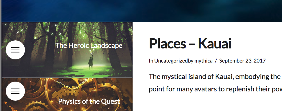
This is the way it is now, with ‘default’ post mode -> https://intothemythica.com/places-kauai/

There, the sidebar is to the left of the featured image, below the header. I would like the featured image to go the full length of the screen and have the sidebar start below it (rather than to the left) in the whitespace of the content.

This doesn’t mean going into ‘fullwidth’ mode in Ethos. I mean keeping the sidebar and having it moved to next to the content in default mode while having the featured image stretch the screen.

thank you :slight_smile:

Hey Peter,

Do you want something like this?

If that is the case, please do this:
1.) please add this JS code in the Theme Options > Global JS (http://prntscr.com/evswzb)

(function($){
	$('.single-post .entry-featured').prependTo('.offset.cf');
})(jQuery);

2.) And please add the following CSS code in the X > Theme Options > Global CSS (http://prntscr.com/evui3r)

.single-post .entry-featured img {
    min-width: 100%;
    width: 100% !important;
}

.single-post .entry-header {
    margin-top: 2em;
}

We would love to know if this has worked for you. Thank you.

AAAHHH!!! You are so awesome!!! thank so big!!!
huge bows

You’re most welcome!
It’s good to know that it has worked for you.

This topic was automatically closed 10 days after the last reply. New replies are no longer allowed.