Hi,
I have 4 cloumns and in each column there’s an image which has a link. Now I want the space between each image to be smaller. How can I do this? If I use margin or padding it doesn’t look that nice on the mobile phone. And I also want the image to be in the center.

Thx
Hi There,
Please add the my-row class to your row contains the columns:
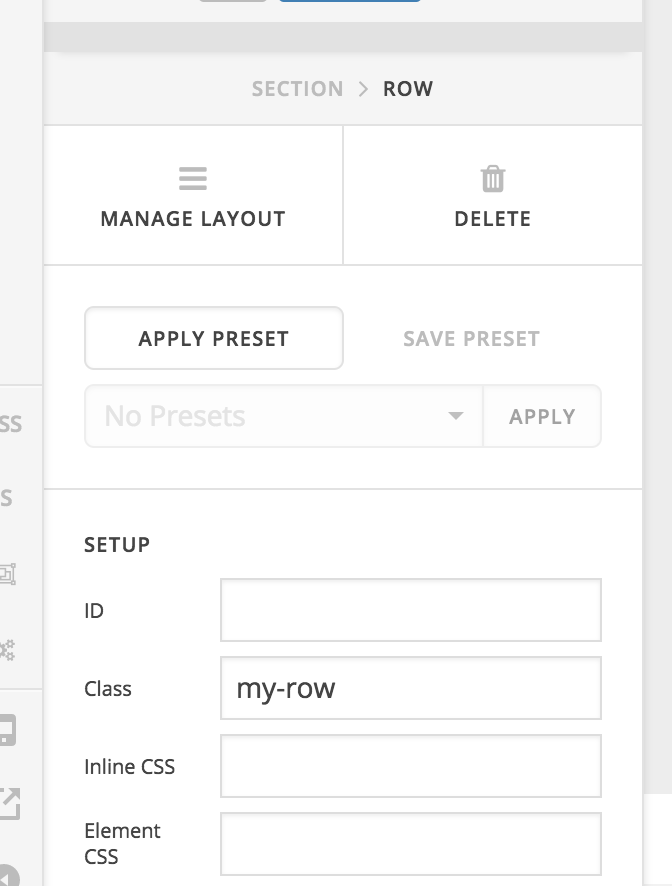
After that add this custom CSS:
.x-section .my-row .x-column.x-sm.x-1-4 .x-image,
.x-section .my-row .x-column.x-sm.x-1-4 .x-image img {
    width: 97%;
    height: auto;
}
Hope it helps 
The space between the images got smaller but the images became therefor bigger. Can I somehow keep the width of the images. I think they have a width of 250px.
Hi there,
The CSS code provided by @thai will set the width of the image element in the row to 97% of the column width.
Let’s try a different approach. Kindly remove the CSS code and use this instead:
@media (min-width: 980px) {
    .my-row {
        max-width: 90%;
    }
}
This will set a maximum with of the row that has the my-row class to 90% of the screen width, therefore adjusting the row and columns’ dimension gap smaller.
You can find more info on how to check for CSS selectors here.
Then information about writing your custom CSS here.
Hope this helps.
Thanks for the help
Just to understand the CSS code: What does this line ->" @media (min-width: 980px) " mean or what does it do?
Hi there,
That is a CSS media query which means that the CSS code inside its block will only take effect on screen widths from 980px and above. So the row that has the my-row class will have 90% width of the container if the site is viewed on devices with screen width of 980px and greater and it will have the default row width of 100% for screen width less than 980px.
We have to do that because when the screen width gets smaller, the container width should be able to respond accordingly by using the default CSS from the theme.
You can read more about media queries here:
https://www.w3schools.com/css/css3_mediaqueries_ex.asp
Hope this helps.
This topic was automatically closed 10 days after the last reply. New replies are no longer allowed.