I urgently need help with displaying the logo in responsive design. In some display widths, it is not displayed at all.
Screen, on the left side:
Above a width of 1456px, it appears on the left.
Screen in the middle:
Logo is not displayed below 1455px
Screen, on the right side:
Below 995px, it appears in the header.
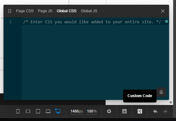
Below is a screenshot showing how the logo behaves in the three different display widths:

However, below this screen width, it disappears completely – that is, between 1455px and 996px.
So…
The logo should be displayed at any width, any time - whether at the top or on the left. How can I fix this problem?