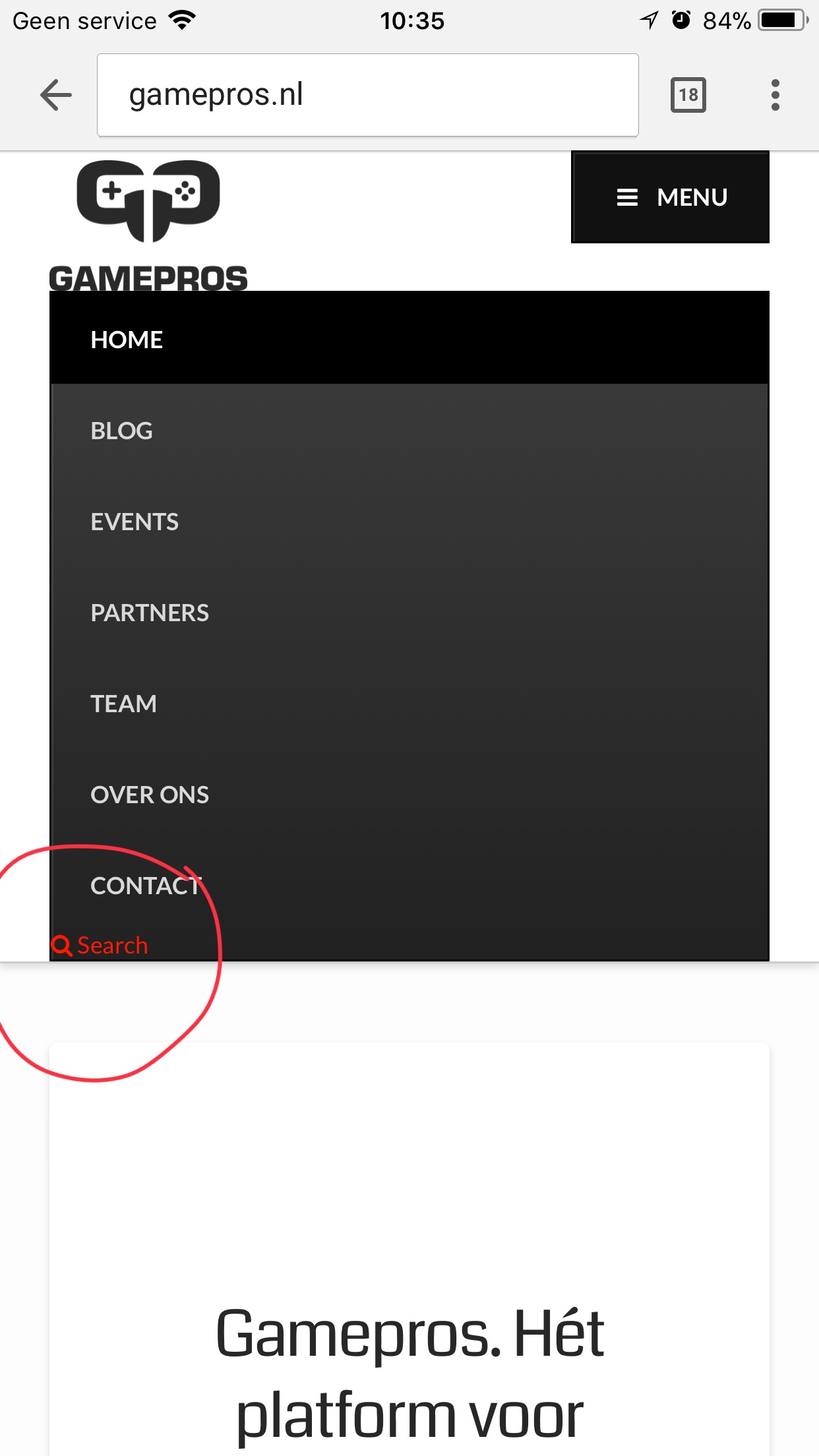
Logo overlaps mobile menu

Hi there,

In the desktop view (www.gamepros.nl) the logo and menu is are looking great. But, when looking to the mobile version of my website the logo interferes with the menu. What should I do to have the logo aligned left to the menu just like in the desktop view?

Thanks in advance!
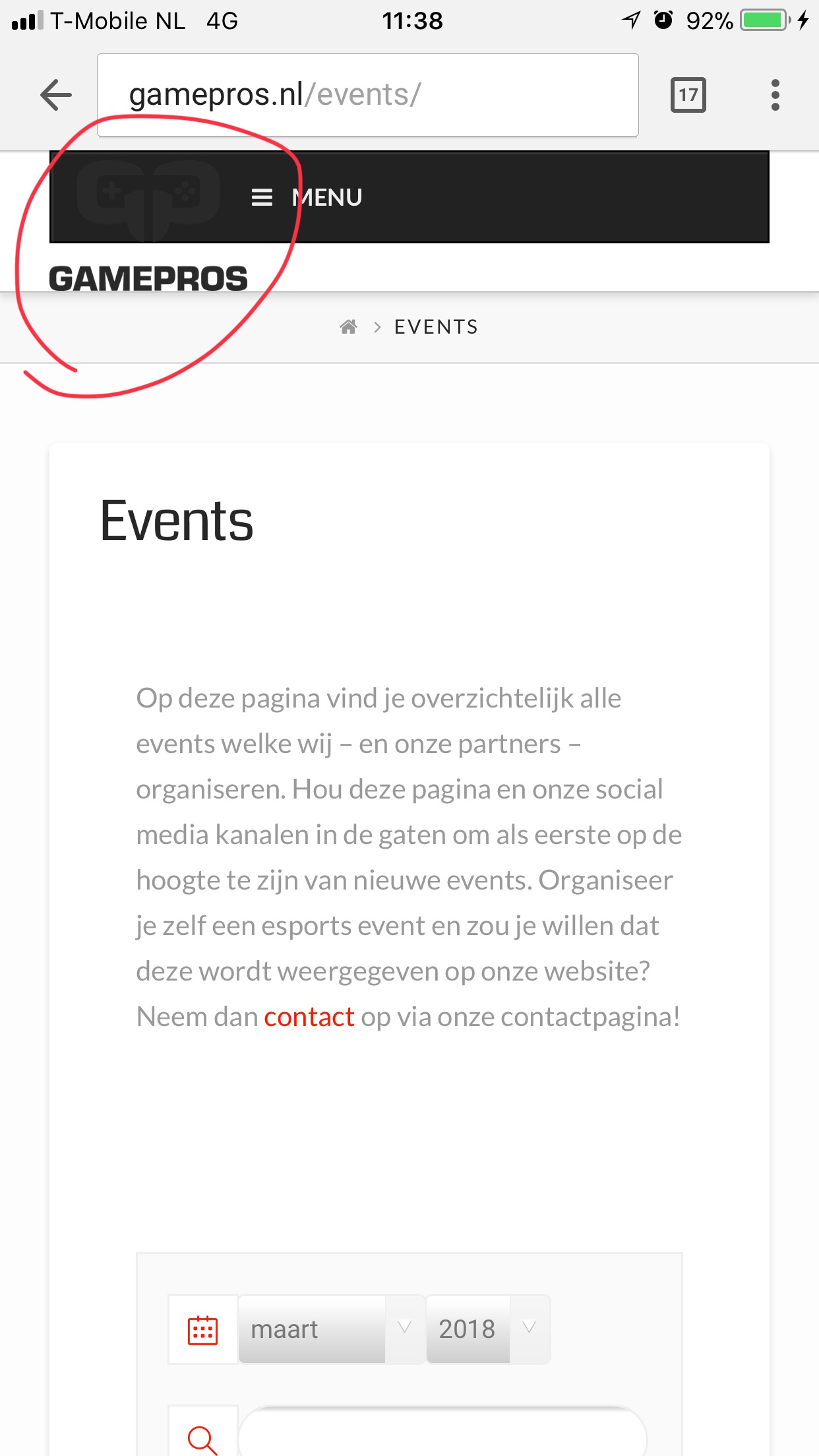
Hi there,

Please try this in the global CSS:

.ubermenu-skin-black-white-2.ubermenu-responsive-toggle {
    float: right;
}

Hope this helps.

Hi Jade,

Thank you very much - it looks way better now. I’ve made a new screenshot as you can see. Perhaps you can help me with 2 last modifications;

  1. In the desktop version there is a bit of padding above and underneath the logo - why isn’t this in the mobile version and how can I achieve this?

  2. The search link is very small and not alligned with the other menu items - how can I make it look the same as the other menu items?

Thank you very much!

Hi There,

Please add the following code to Theme Options CSS

@media(max-width: 769px) {
.x-brand img {
    padding-top: 10px;
    padding-bottom: 15px;
}}

Regarding your search icon, you are using X Search functionality which is not integrated with Ubermenu.

Please turn off the search option from > X > Theme Options > Header and turn it on on Ubermenu itelf:

Hope it helps

1 Like

Thank a lot Joao - it works and looks perfect now! :smiley:

You’re most welcome.

This topic was automatically closed 10 days after the last reply. New replies are no longer allowed.