Logo/menu layout problems on mobile in Pro Icon stack

My site is happydogsnyc.com. I’m using the Pro Icon stack.

The icon layout looks fine on desktop, but doesn’t look right on mobile. First, there is too little space between the icon and the horizontal line below it, making it look cramped. Second, the hamburger menu on mobile looks out of alignment with the logo – it’s neither lined up flush with the top of the logo nor centered vertically with it, so it just looks poorly designed.

See screenshot below.

To be honest, this falls quite short of the level of design polish that I expect from a professionally designed theme like Pro.

Can you help?

Thanks, Ien

Hello Len,

Thanks for writing in!

Do you want to display something like this instead?

I can see that you have added some custom CSS. To achieve the look I presented above, you will need to add the following code:

@media (max-width: 767px) {
    .x-topbar .p-info {
        margin-top: 10px;
        margin-bottom: 10px;
        border-top: 1px solid rgba(0,0,0,0.075);
    }    

    .x-brand {
        margin-top: 22px;
        margin-bottom: 22px;
    }

    .x-btn-navbar {
        margin-top: 40px;
    }
}

Keep in mind that these codes were simply taken from your own code and made sure that it will also take effect and be applied on smaller screens too.

We would love to know if this has worked for you. Thank you.

Thanks. Yes, that screenshot is definitely a better look.

I put that CSS in and the spacing below the logo on mobile is per your screenshot, but the hamburger menu is not centered per your screenshot.

By the way, I removed my custom CSS and the original poor design on mobile is the same, so that is not caused by my CSS.

Hey @happydogsnyc,

It’s good that you temporarily removed your CSS to know where the issue is coming from. Please don’t insert back while the issue persists.

The issue here is most probably the alignment configurations in Theme Options > Header. Have you tried tweaking the Navbar Top Height, Logo – Alignment, Links – Alignment, etc? If not, you can learn more about those options here: https://theme.co/docs/header

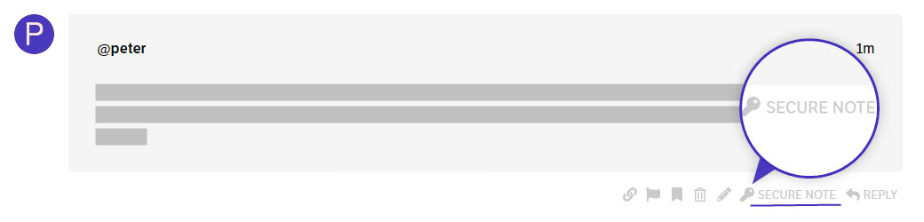
Please also provide the following info in a Secure Note because the credentials you’ve given in your other threads don’t seem to work anymore.

  • WordPress Login URL
  • Admin level username and password

You can find the Secure Note button at the bottom of your posts.

Thanks.

Thanks. I’ve added a new secure note above.

While you are looking at this, can you also see how to make the mobile hamburger icon larger, so it fills the space better?

Hello @happydogsnyc,

You can tweak the logo image in Pro > Theme Options > Header > Logo - Image.
Check this out: https://theme.co/docs/header#header-logo-settings

And to make the mobile hamburger icon larger, please go to Pro > Theme Options > Header > Mobile Button. You need to adjust the button size and alignment.
grD_rXYSTiqepI85AUVCAA

We would love to know if this has worked for you. Thank you.

This topic was automatically closed 10 days after the last reply. New replies are no longer allowed.