Hello,
How can I align the submenu items to be left aligned under each main menu item on mobile only.
Hello,
How can I align the submenu items to be left aligned under each main menu item on mobile only.
Hello Justin,
Thanks for asking. 
Please add following CSS under X > Theme Options > CSS:
.x-navbar .mobile .x-nav ul {
    margin-left: 0 !important;
}
1- I have found the proper CSS code selector using the Chrome browser Developer Toolbar: https://www.youtube.com/watch?v=wcFnnxfA70g
2- For the CSS code itself, I suggest that you get started with this tutorial: https://www.youtube.com/watch?v=yfoY53QXEnI
Thanks.
Hello,
That moved the main menu items… I was trying to left align the submenu items… Is that possible?
Hi Justin,
To left align the submenu, you will need this custom css:
.x-navbar .x-nav-wrap.mobile .x-nav li.menu-item-has-children .menu-item a {
    text-align: left !important;
}
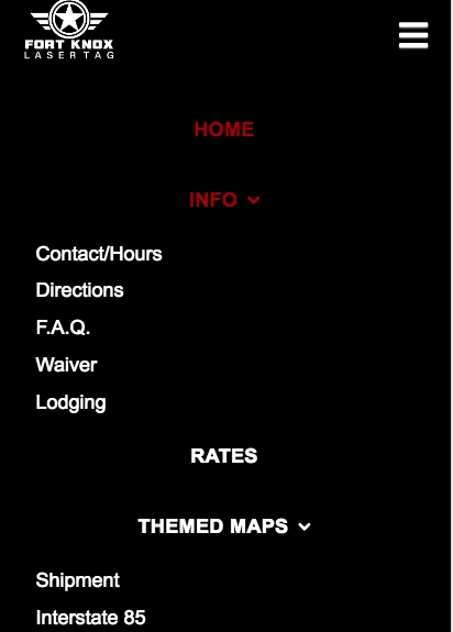
Again after saving your changes, please clear your caches since you have install W3 Total Cache.
Hope this helps. Please let us know how it goes.
That is not quite what I am trying to make it look like. I wanted the sub menu item on mobile to be left aligned under each main menu item. I attached a picture to explain.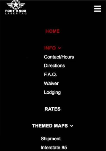
Hi there,
That is not exactly possible due to the structure of the menu and the menu items on mobile but you can try this code and adjust it:
.x-navbar .mobile .x-nav ul {
    max-width: 170px;
    margin: 0 auto;
}

.x-navbar .mobile .x-nav ul li a {
    text-align: left;
}
Please note that the code above will not align all the submenus to each of their parent menu. If you want to have them perfectly aligned to their parent menu item, you will have to customize the code further as code customization goes beyond the scope of our support.
Hope this helps.
This topic was automatically closed 10 days after the last reply. New replies are no longer allowed.