Layout for menu items

Hello,
I’m revamping my website myself, being a non-IT person. After setting up my website more than 6 years ago, I re-read your documentation on layout and headers. But I don’t seem to find solutions to my problem.

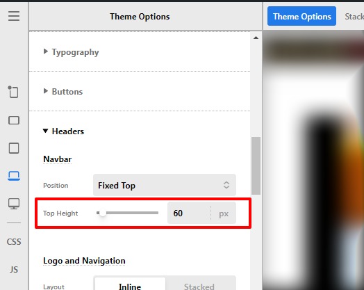
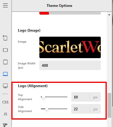
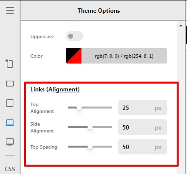
If you see the screenshots, you will see the menu items flushed right to the top edge. In the mobile port view, when the menu icon is clicked, the menu items drop down but are flushed to the left edge. I have tried varying the “links alignment” but to no avail. Am I missing something?


Will appreciate you pointing me to the right direction and giving me a tip or 2 how to better improve layout of the affected pages, which are confined only to Woocommerce pages and Forms.

Hello @iamwithU,

Thanks for writing to us.

It seems that your Header menu setting is not correct, I would suggest you go to the theme options and set the following settings.

1 Set the Header Height, go to the Theme Options —>Header —>Top Height
Theme-Options-Pro (6)

2 Set the Logo margin Theme Options —>Header—>Logo alignment —>Top alignment/ slide alignment.
Theme-Options-Pro (7)

3 Now you need to align the header menu items, your settings should be like this, please have a look at the given screenshot below.

Theme-Options-Pro (8)

Hope it helps
Thanks

That’s fantastic, Prakash! So grateful for your help in tidying up my header and menu items on the desktop view.

As for the mobile screen - you notice the menu items are touching the left edge. Any suggestions how to better position them?
Also, for my header, what should I do if don’t want any white space on top and below my logo. Is it ok if I shorten the header height?
Thank you for your patience.

Hello @iamwithU,

Yes, you can decrease the Header height in order to remove the white space under the logo and there won’t be any issue if you would decrease the header height, you need to go to Theme Options —>Header —>Top Height.

You need to add this custom CSS code under Theme Options —>CSS to get rid of the mobile screen issue.

@media(max-width:978.98px){
.x-nav-wrap.mobile {
padding: 0 15px;
}
}

The purpose of providing custom CSS is to show you how to add CSS code to your site. Writing custom CSS is outside the scope of our theme support. If you need more customization, you need to learn CSS and learn how to use the browser’s element inspector.In case you have no idea about coding you can subscribe to One where customization questions are answered.

Hope it helps.
Thanks

Thank you Prakash, for your prompt responses. Appreciate your effort very much.
Excellent support!

You are most welcome @iamwithU

This topic was automatically closed 10 days after the last reply. New replies are no longer allowed.