Hi There!
I have a column set up with Layered navigation elements and somehow the styling gets messed up when there are two or more. Space is automatically added below each element. (see: https://live-rns-dc.pantheonsite.io/press-release/ under the archives area in the right sidebar.). When there is just one, it works fine but when I put the second one, it automatically adds weird spacing. Could y’all take a look? Thanks!
Hello @suzannereid,
Thanks for writing in! Navigation layered element works best with only one element on the page. The height changes every time you click on the submenu items which explains the weird gap between the two elements. It expands or collapse as you click on the submenus. Generally, it is intended for the header with the off canvas display. Adding it to the content area may not result in a good way. It is best that you use the navigation collapse element instead.
Hope this helps.
OK. So, there’s no way to remove that gap?
Hey @suzannereid,
At the moment, there is none.
Please make use of the Navigation Collapse element instead.
Regards.
ok. The problem is that I want the list to be in a sidebar.  I will figure out a solution.
Hi @suzannereid,
That seems to be a bug, I’ve submitted this to our issue tracker so the developers will be made aware of it.
For now, the workaround to that is to have the Navigation layered in a separate nested ROW. That means do not put directly the Navigation layered in the column, place two ROW Element first inside the column, then each of that nested ROW element add your Navigation layered element, so your section structure should look like this:
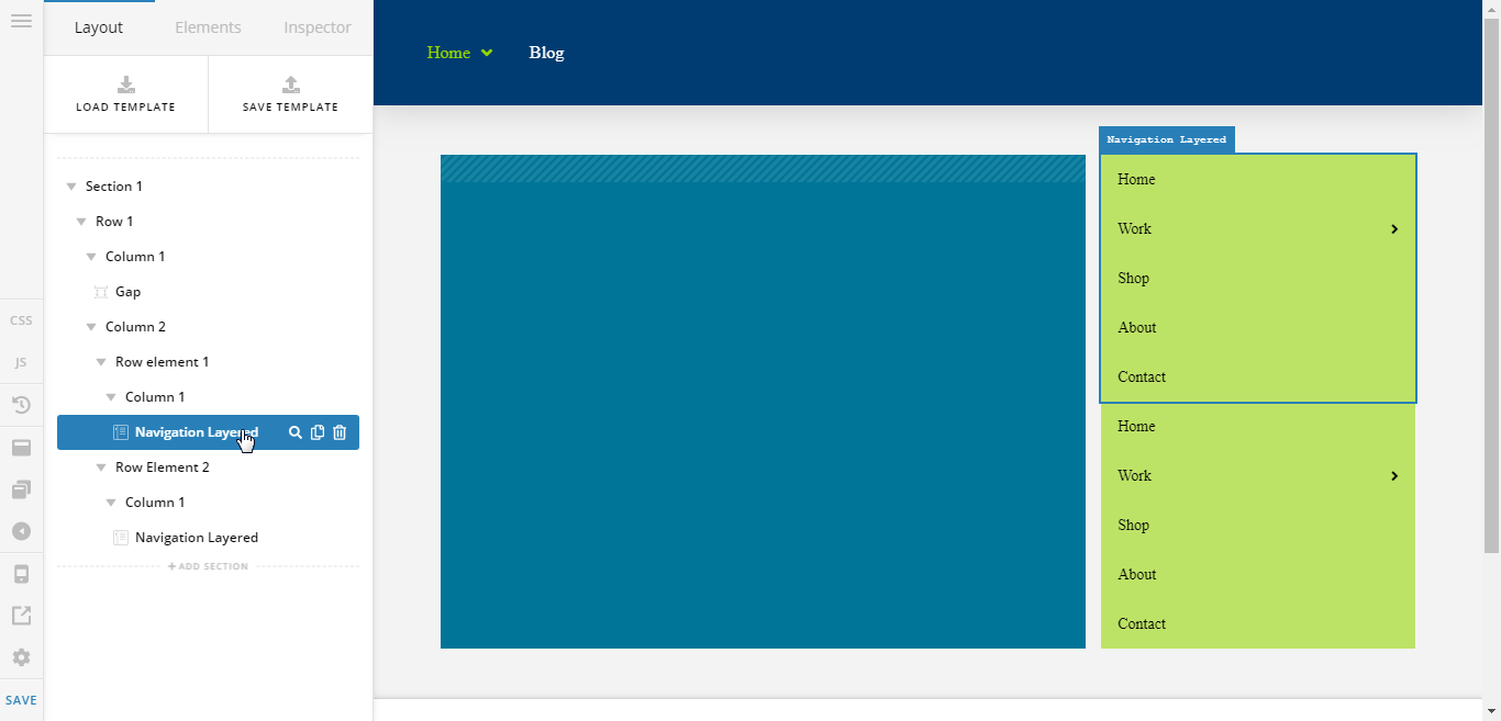
You don't need to restructure the left column, just the right one.
Cheers!
1 Like
You’re must welcome,
Cheers!
This topic was automatically closed 10 days after the last reply. New replies are no longer allowed.