I can’t seem to get the responsiveness to work in Pro.
Any suggestions on what I am doing wrong?
I can’t seem to get the responsiveness to work in Pro.
Any suggestions on what I am doing wrong?
Hello @madref,
Thanks for writing in!
Your slider is working as expected. The header container has a maximum width of 1200 pixels and since your slider has the same maximum width, it displays as expected. Responsive will kick end as soon as you view the site in smaller screens.
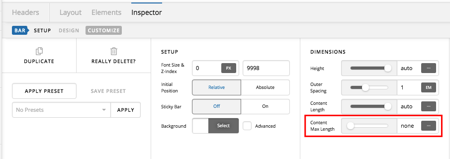
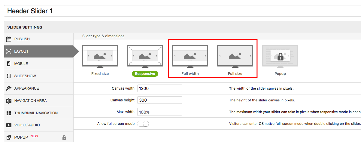
If you want to have a fullwidth or full-screen responsive slider, then you will have to set the maximum width of the header to none. And then edit your slider and change the slider type to Fullwidth or Full size.
Hope this helps.
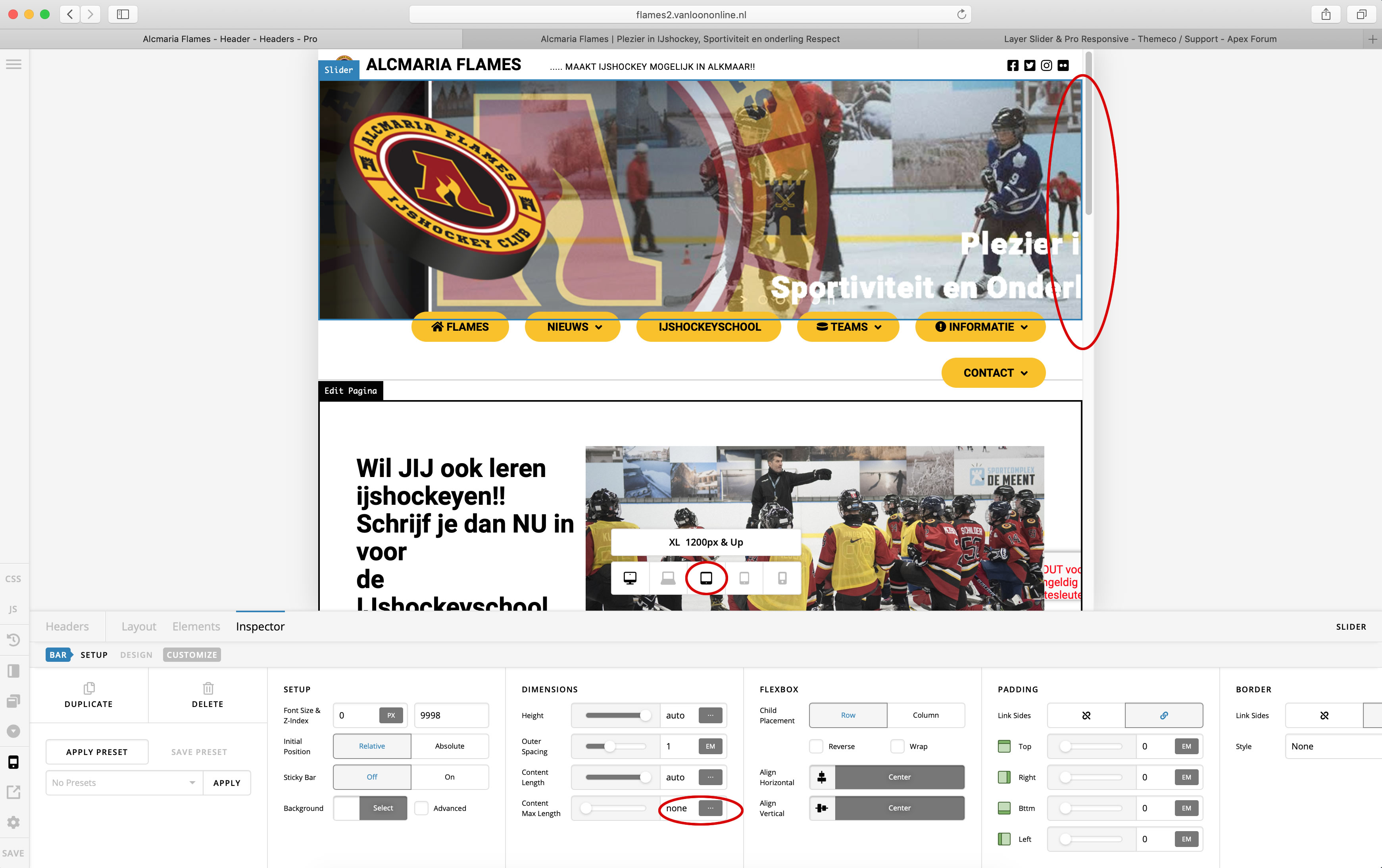
I have changed the setting as you suggested to none. But the result is the same.
See picture of the screen I took
Hello @madref,
I have edited your header and set the content length to 100% and set the slider type to Fullwidth.
Please check your site now.
oke at full width it is working…
But is it possible to get it to work at 1200x300 px?
Hi There,
I tried and it is not working on the intended size. Layer slider has different calculation. We can set it fixed or fullwidth. See sample fixed here: https://flames2.vanloononline.nl/404-2/. When I tried the responsive, it calculates differently and add left margin and it end up too small.
I would recommend to try REVSLIDER. You can achieve the same and it has more options.
Hope this helps.
This topic was automatically closed 10 days after the last reply. New replies are no longer allowed.