Lawyer demo problems. Scrolling, Sticky Header, newsletter sign up and global block issue

Hi, Great product and even better support. I thank you for being so helpful. I have run into a few problems on the LAwyer Intergity stack site namely;

My Site is http://www.jacksonwray.com/

1- On mobile version the page sticks, I have read other threads but the code snippets do not seem to work. I do have 2 footers, 1 for mobile and 1 for desktop so I am thinking it could be a problem there but really spent time trying to find this to no avail.

2- I popped a little bit of code in to make my header sticky. It works ok with desktop as you see but on mobile its very messy and doesn’t work well. It hides the first section of content on every page a little and this may be linked to my scroll issue mentioned above

3- I have a little bit of code writing in my global block footer for desktop that I would like to act as a button to send an email. I have put a raw code section in but 2 things are now happening. I cant get the code to work (This code was taken from the Crafty footer website ) to send an email and secondly it is knocking out the 4 sections below namely Contact, Services, About, Pricing, something is knocking the Contact block off line from the others…eeekkkkk! :slight_smile:

Thankyou for your valued support

Hi Gareth,
Thanks for reaching out.

Please find the comments on your points:

  1. Can you please clarify what exactly mean by page sticks in the mobile. And there are no footers are found in your Header & Footer builder inside Pro > Footer.
    As you are installed the Pro, you can use the Header & Footer builder to create multiple numbers of customized headers and footers for your site and can assign it to any pages.
    Please find the documentation here: https://theme.co/docs/header-footer-overview

  2. As you are using the Pro there is the option to create the Sticky headers using the Bar element, which have sticky options for it.
    I would also suggest you create multiple bars inside the header or footer and make those hide in different breakpoints by the options available inside the Customize tab.

  1. Can you please check once by removing the code you are referring to. I would also request you to show us the code which you are using for sending the emails.
    Please remember that we don’t offer any support to the custom codes or issues related to it.

Thanks

Hi @tristup, thanks for getting back to me;
1- Can you please clarify what exactly mean by page sticks in the mobile. And there are no footers are found in your Header & Footer builder inside Pro > Footer . - I am using the original header that came with the Theme, its not a pro header its the original. There are multiple problems with this . I have attached a screen shot of the issues I am facing. It overlaps and sticks and is a bit of a mess. I recorded a screen video of the problems but unfortunately this forum will not let me upload it. Can you go to the mobile version of www.jacksonwray.com to see. The header hides my page title and the logo does not appear. Very frustrating. I will really appreciate your help on this one. The only way I can describe how the PAGE STICKS is if you visit the mobile version of this site. Thanks

2- As you are using the Pro there is the option to create the Sticky headers using the Bar element, which have sticky options for it. - No, I am using the original header in the lawyer theme which is not a pro header. I have tweaked over and over again and I have had some success but on mobile version it is very messy. The logo on my header on mobile still doesn’t appear?

3- This is the original code taken form the crafty site.

Sign Up

I want this code to do a simple email to [email protected]

Thanks for your help on the sticky scrolling, header covering issue and the newsltter code

Hi Gareth,

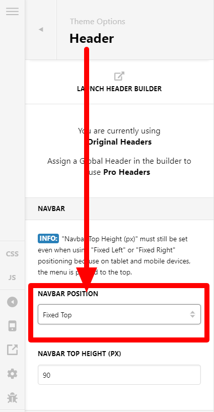
Let comes to your point one by one, the option for the default sticky header is available under Theme Options > Header.
In case if you are using any custom codes, you can remove and use the option as described in the screenshot.

In mobile, we found that the image set as a logo, is not available in the desired location, you may need to reset it, if not done already.
We have tried to replicate the issue, in the mobile version and found the logo issue, but does not fund the issue with hiding the header issue you pointed out.
Please find the video here: https://www.awesomescreenshot.com/video/797872?key=1e9be9a1b2c6210ab110d01a9326e45e
The code that you used to email, you mentioned in your comment is not found on your home page.

If that does not resolve the issue, please share your site URL and the credentials in the secure note to examine the problem further, including:

– WordPress Site URL & Admin URL
– WordPress Admin username / password

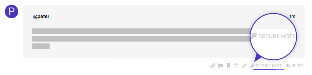
To create a secure note, click the key icon underneath any of your posts.

Thanks

Hi @tristup, Thanks for a speedy reply. very very kind.
OK, here is the latest;
1- I had my header set to sticky but the hamburger menu on mobile doesn’t stick in mobile version. Can you provide a solution to how I make this stick in mobile devices. Thankyou.

2- I set the image as logo for mobile and it appears to be working well now. Thankyou. This was caused as the desktop logo on this site demo needs changed in CSS. I followed another thread. This working fine now. :slight_smile:

3- I took the code out of my footer as it was causing so many problems, I think I will just keep this out.

The site still sticks , please load the mobile version on an actual mobile device (not the mobile screen preview on the Pro viewer) and then quickly try to scroll through the content.

Also I think it is now best to delete the bottom footer logo that appears. Can you supply the code that will let this happen. Once again I have tried numerous threads and this wont budge.

I thankyou for your help

Hi Gareth,

1.) We need to override the integrity CSS in mobile in order for your mobile menu to have an sticky effect. To do that, please add this code below in your Pro > Theme Options > CSS.

@media (max-width: 979px) {
	.x-navbar-fixed-top {
		position: fixed;
	}
}

2.) We are glad that you are able to solve your isssue.

3.) Can you please explain further about the issue in your footer so that we can better assist you with your concerns.

Hope that helps and let us know how it goes.

Thank you.

Hi, Thanks issues 1 and 2 are now solved, great support , thanks. The scrolling issue is now solved also.
Issue 3 - The bottom logo I would like to remove. See this screen shot. IS it possible to remove it. (It is the black JW logo in bottom left of screenshot) Thankyou.

Hi @shawinglasgow,

Custom code is found in Theme Options > CSS which is setting the background image for the specified selector. Please remove or comment out the background-image attribute from the following code to get rid of the bottom logo you are referring to.

.site:before, .site:after {
    content: "";
    display: block;
    position: absolute;
   /* background-image: url(http://www.jacksonwray.com/wp-content/uploads/2020/08/Jackson-Wray-Proofreading-2.png); */
    background-repeat: no-repeat;
    background-size: cover;
    width: 100px;
    height: 100px;

}

Thanks

This topic was automatically closed 10 days after the last reply. New replies are no longer allowed.