How can we keep three squares the same size (ONLINE, SHARE WITH US, VIDEO RECORD) when the size of screen changes? https://nationalveteranstributenetwork.org/stories/
Hi,
You can try adding this in Cornerstone > Settings > Custom JS
jQuery(document).ready(function($) {
	var max = 0;
	$("#x-section-4 .x-column").each(function(index, el) {
		if( $(this).height() > max ){
			max = $(this).height();
		}
	});
	$("#x-section-4 .x-column").css('height', max);
});
Hope that helps.
For some reason I cant fine the Cornerstone > to go settings. Can you clarify where I find this. I’m using Pro Theme. Does that change things? I did try adding on the page I wanted the squares to stay consistent but it didn’t work. Any suggestions?
Hi There,
Please click JS icon on the left sidebar:
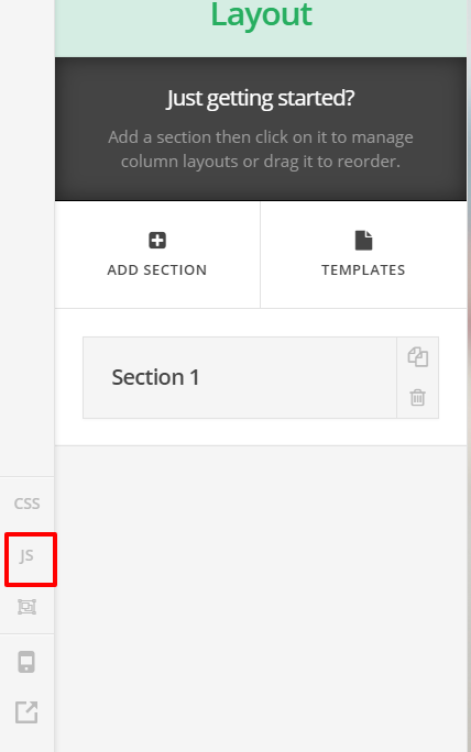
Please adjust the code:
jQuery(document).ready(function($) {
	var max = 0;
	$("#x-section-2 .x-column img").each(function(index, el) { alert($(this).height());
		if( $(this).height() > max ){
			max = $(this).height();
		}
	});
	$("#x-section-2 .x-column img").css('height', max);
});
Your image is on section 2. So we adjusted the code to work on section 2 and on image element not on columns. See this: https://screencast-o-matic.com/watch/cbQjXbI6FN
Just note that setting images with different size to have the same height might affect it’s proportion.