Issues with team plugin and full width contained background image

Hello!

I have a couple issues I need to get resolved asap as I need to share the site with the client for initial review tomorrow:

  1. On the Our Physicians page (linked below), the panel that slides in from the right should also display on top of the menu. I need the background overlay to come over the top of the header as well. Also, when scrolling up and down on desktop the header comes over the top of the panel.


Further, the mobile interaction for these team members (the doctors) is not working correctly. I tested on a couple other sites but only seems to be an issue with Pro theme.

  1. How can i make the background image on the page below display as a cover but also full height? Currently I have it’s position set to bottom center because of the wave at the bottom that needs to display without getting cut off but the result is the heads getting cut off. I feel there is probably an easy solution to this but have tried many options without success.
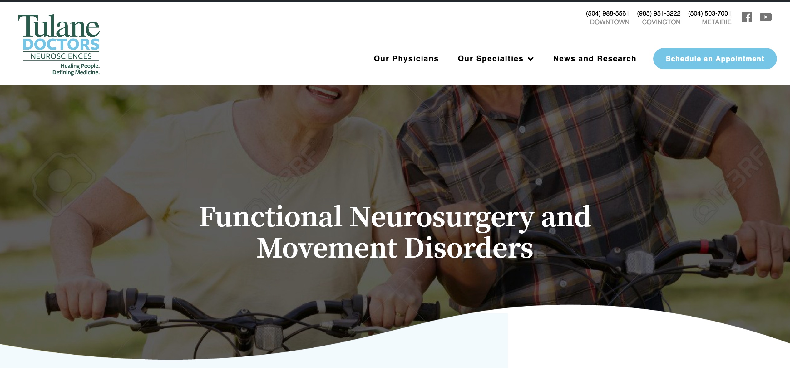
Thanks!

Hello @nathandutoit,

Thanks for writing in!

1.) It seems that you are using a 3rd party plugin, GS Team Member Premium in displaying the images. Regretfully we are not quite familiar with this plugin. I would recommend that you contact the creators of this plugin to be able to modify or customize it according to what you have in mind.

2.) You cannot properly set the background image without making any compromises. You can have the size as 100% 100% and it will display the whole image no matter. The only draw back is that your image will be displayed stretch or squeezed. I would like you to try this demo here: https://davidwalsh.name/demo/background-size.html which would explain how background image works.

You use the background-image: cover; which would cover the whole area of the container. This is responsive enough which will always covers the whole area. The only thing to consider here is that if your image size is smaller, it will be stretch out and if you have a bigger image, it will get cut off.

Yes you can use background-size: 100% 100%; which is also responsive but your image will either be stretch out or get squeezed depending on the size of the container.

Yes you can also use background-size: 100% auto; but then as soon as you resize your browser or on smaller screen sizes, you will probably have white spaces around the image.

Or you can also use background-size: contain; but then this is not a good choice because you will see white spaces around your image.

The best thing you can do is to edit your background image. Separate the people image and your wave shape as another image. You can then use background image for the upper and the lower layers.

Hope this helps.

Thanks for your help.

Regarding number 1, I’ve reached out but haven’t been able to get support. I’ll keep trying!

2.) I think I tried all those options you have recommended, however, I’m wondering if I can achieve something like the banner image on this page:

https://xula.edu/department?id=art

Thanks!

Hi,

On that site the image is being displayed as <img> and not as background of an element, you can achieve that using an image element in Cornerstone.

Thanks

This topic was automatically closed 10 days after the last reply. New replies are no longer allowed.