Is it possible to force ubermenu to show the navbar toggle button at a certain screen size breakpoint?

Hi, I’m using ubermenu and the menu is quite long and when I resize the window to see how it looks on a mobile device, the menu goes under the logo instead of showing the navbar toggle button. Is it possible to force ubermenu to show the navbar toggle button at a certain screen size breakpoint so the menu doesn’t go under the logo?

Hope that makes sense!

Here’s a screen grab to show you what I mean about the menu going under the logo:
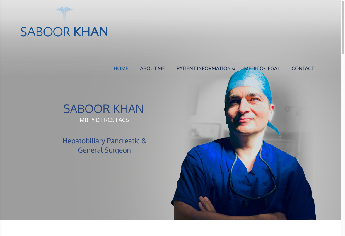
I’ll put the URL in a secure note as it’s got a construction page up at the mo.

Thanks!

Hi @core365,

Thank you for writing in, yes you can have a Custom Breakpoint on UberMenu, please see the following documentation.

Custom Breakpoint.

Hope it helps,
Cheers!

Hi @friech,

That’s great, thank you! I haven’t had much experience using UberMenu, I mainly just stick to the one that comes with your theme and then use CSS to adapt it, so I thought you needed to do the same with UberMenu, sorry! I appreciate you sending the link for the documentation.

Thanks!

You’re most welcome,

Cheers!

This topic was automatically closed 10 days after the last reply. New replies are no longer allowed.