Is it possible for an image to fill the height of a column but keep to the width of the column?

Hi, I’m working on a site and I’ve split a section into 2 columns, with an image on the left and text to the right. The thing is, when viewed on some screens, the image doesn’t fill the height of the column. Is it possible for the image to fill the height but not go over the width of the column, and to keep it’s proportions so the image isn’t just stretched height wise to fill the gap? I don’t want to do it as a background image as I need to keep it as a proper image so I can use an alt tag with it.

I’ve attached a screen grab for you to see.

I’ll put the URL in a secure note as it’s on a temporary link.

Thanks!

Hello @core365,

Thanks for writing in!

Please do the following:

  • Inspect the image element and under Customize > Setup > Class add a class name.

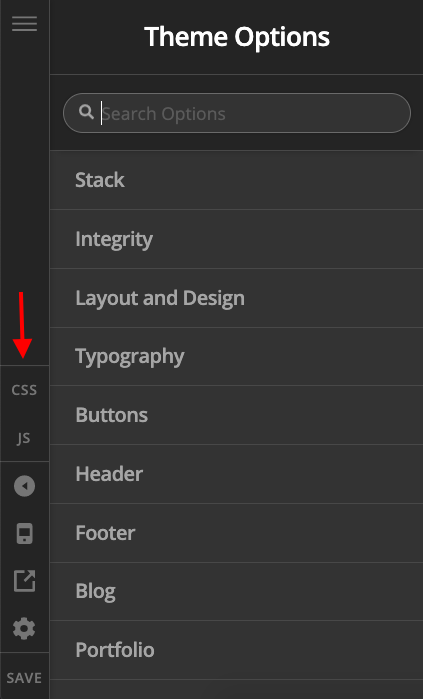
  • After that add following CSS under X > Theme Options > CSS:
.plan-it {
    position: absolute;
    top: 0px;
    height: 100%;
}

Please replace class name plan-it as per your requirement.

Thanks.

Hi, thanks, but unfortunately it didn’t work. I tried adding !important after each line but that didn’t do anything either!

Cheers

Hi @core365,

Since the columns in the row are marginless columns, the height of the columns are equal so you can try setting the image as the column’s background image instead.

Hope this helps.

Hi, sorry, I’ve just checked the image when I’m not in the admin and it it’s correct! The height of the pic fills the column! It’s not showing that way in Cornerstone, it’s still got a big gap at the bottom of the it!

Thanks for all your help!

Hello @core365,

Thanks for updating in!

The image element may fill the width of the column. The height, on the other hand, will be automatic and dependent to the relative height of the image. The image height will become shorter and shorter as the width becomes narrower. Unless otherwise, you will set the width and height to 100%. The only problem with this setting is that the image will be stretched out or will be squeezed in order to fit in the column.

@Jade have suggested that the image should be placed as a background image of the column instead. The image will then cover the whole column area. The only problem with this setup is again the image will be zoomed in and some parts of the image will be cut off since it will try to fill the whole column area.

If you can give me access to your site, I can apply @Jade’s suggested solution and apply the image as a background image of the columns just like this:

Hope this explains it.

Hi @RueNel,

The only problem with having the image as a background image instead is that you can’t assign any alt text to it, that’s why I prefer to use an image element whenever possible.

Thanks!

Hello @core365,

Let’s try this one: please update this code:

.full-image-height {
    position: absolute;
    top: 0px;
    height: 100%;
    overflow: hidden;
}

to

@media (min-width: 768px) {
    .full-image-height img {
        position: absolute;
        top: 0px;
        height: 100%;
        overflow: hidden;
    }
}

However, please be aware that you might still need to make adjusts in the code as it is really to control the display of the image especially if you are trying to alter how they should behave by default just like this case. Also since the code above forces the image to fill the entire area of its container, the image might look stretched in some displays In the event that you need further changes to the code above, it would be best to get in touch with a developer.

Hope this helps.

Hiya, thanks for the updated CSS, however this now stretches the image out of proportion, it fills the height but doesn’t change the width accordingly, so it’s all elongated!

Cheers

Hi @core365,

I have previously mentioned the possible outcome of this approach. Kindly get in touch with a developer if you intend implement this on your site since this is already goes beyond the scope of support we offer and we have provided already provided you with some workaround in this thread.

Thank you.

Ah ok, sorry I didn’t read the text properly, I was focussing on the CSS!

Thanks for your help!

You are most welcome. :slight_smile:

This topic was automatically closed 10 days after the last reply. New replies are no longer allowed.