Is it possible for a button to fill the width of column only when viewed on a mobile device?

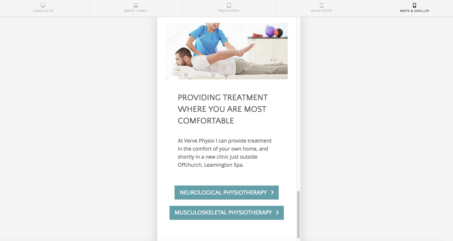
Hi, I’m working on a site and I’ve used 2 buttons side by side each other and I’m happy with how it looks when viewed on a desktop. When you view it on a mobile device, the buttons are aligned one on top of another but because they are different widths it looks a bit odd! Is it possible to have the buttons fill the width of the column only when viewed on a mobile device, just so they are both the same width? I can’t figure out the CSS to do it!

I’ve got a construction page up at the mo, so I’ll put the URL and By Pass Password in a secure note.

Here’s a screen grab of the 2 buttons I’m referring to:
Thanks!

Hi there,

You can add a CSS code to set the buttons full width on mobile. Please try this code in the Global CSS:

@media (max-width: 767px) {
    .x-anchor {
        width: 100%;
    }
}

Kindly note that since this is a custom code that changes the default behavior/display of the theme, you will be responsible to maintain or update the code in case you require further changes or if the code stops working in future updates. If you are uncertain how to proceed, it would be best to get in touch with a developer.

Hope this helps.

Hi @Jade, thank you so much, that was spot on!

I really appreciate your help!

Glad we were able to help :slight_smile:

This topic was automatically closed 10 days after the last reply. New replies are no longer allowed.