Hi! I am running on PRO a website but my menu on ipad vertical does display like a hamburger, but on ipad horizontal view it gets the normal desktop, how can I change this, I want the burger too on ipad horizontal view.
Thanks
Hey there,
Thank you for reaching out to us. To make the mobile button appear on iPad horizontal view too just add the following code in the Theme Options > CSS:
@media screen and (max-width: 1200px) {
  .touchevents a.x-btn-navbar {
    display: block;
    float: right;
  }

  .touchevents nav.x-nav-wrap.desktop {
    display: none;
  }
  .touchevents .x-nav-wrap.mobile:not(.x-collapsed) {
    display: block !important;
  }
}
Don’t forget to clear all caches including your browser’s cache after adding the code. Let us know how this goes!
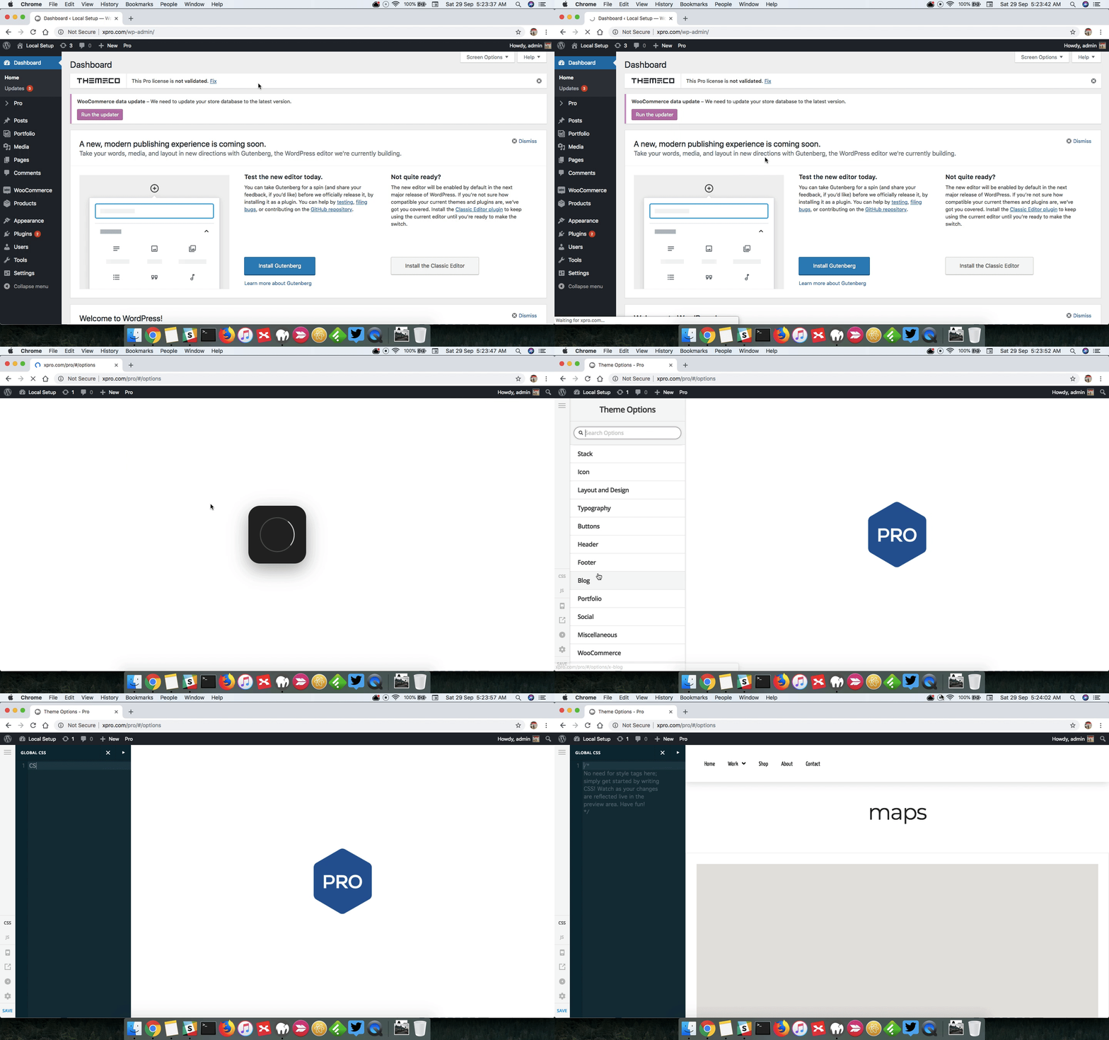
What does Theme Options > CSS means? is it something on the wordpress dashboard? is it via FTPs or how do I get to that? I have seen this kind of answer but I could never find where Theme Options > CSS is. And is it some code that already exists? or is it something new to add only? Could you please be more specific since I am not a programmer. Thanks
Hello @mycoffeebox,
Thanks for updating the thread.
You can access theme options from Pro > Theme Options > CSS. Here’s a screencast that you can take a look.

Thanks.
Excelent!! thanks that clears it all! And I added that code and it works now! Thanks a lot!
Glad to hear everything is working now 
This topic was automatically closed 10 days after the last reply. New replies are no longer allowed.