Internet Explorer Not Redering Correctly

Hi, I’m having a major issue with the site in internet explorer. My client and their site visitors are mostly using PC and probably IE. The site is www.1111lincolnrd.com. I’ve run into any issues in Chrome, Safari, Firefox and Opera. The client is also complaining that images are grainy.

I am using IEonChrome.com to recreate the problems, https://ie10.ieonchrome.com/#http://www.1111lincolnrd.com/.

The main issue has to do with columns it seems.

This is always wrapping the 5th image on IE.

This is just blowing up huge.

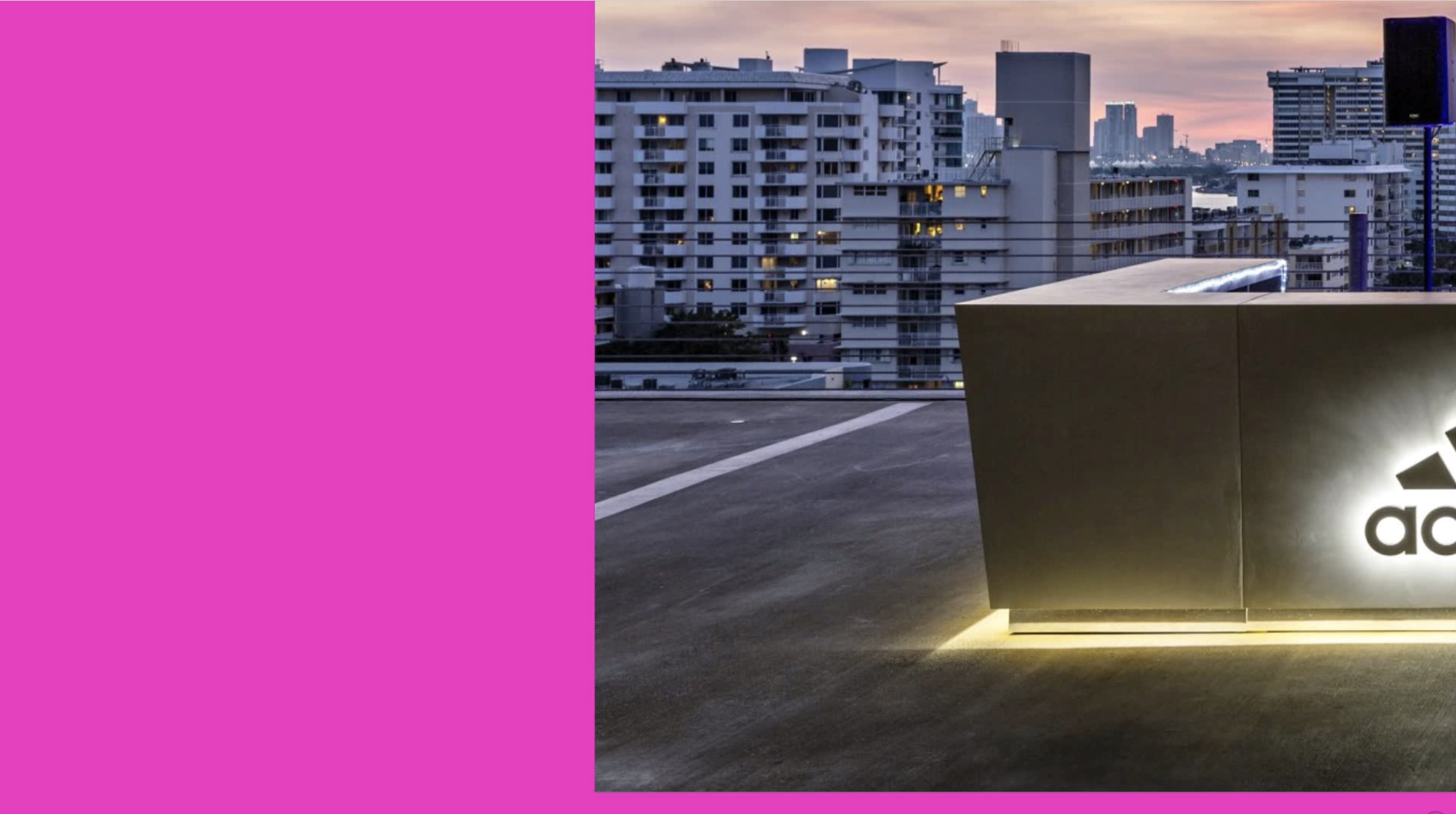
The previous 3 images are supposed to look like this:

Also, on internal pages with multiple columns they are turning out like this.

Instead of this:

Do you have a better way to suggest checking it on IE?

Hi @jmccarley,

Thanks for reaching out.

The IE browser isn’t recommended one since there are many issues, it doesn’t fully support modern features that other browsers use. But, I will be more happy to help you with this :slight_smile:

First, please add this CSS to your global custom CSS

.x-image img {
width: 100%;
}

Looks like IE uses the original size if you don’t define it (flex layout related).

As for the featured retailers, it’s due to your custom CSS.

	 	.shortcode .WidgetCollection-get_content-item-shops {	 		
	 	
			-webkit-flex-basis: calc( 20% - 20px );
	 		flex-basis: calc( 20% - 20px );
	 	
	 		padding: 0px;
	 		border: 1px solid #000;
		}

Try it around 23px to 30px instead of 20px. This isn’t theme related so it needs to be done manually.

I also checked the gallery and the first CSS should fix it. If you’re not sure about the CSS, you can add width to your images too by its setting.

Thanks!

Hi,
Thanks so much for that help. The first global CSS fixed all of the grid problems. However it seemed to have created a new one.

the 1111 logo in the header is now too large. Suggestions?

I am still playing around with the custom CSS for the featured stores.

Hi There,

Let’s modify the CSS code provided to exclude your logo. Please update the code to this:

/*image and card fix on IE*/
@media screen and (-ms-high-contrast: active), screen and (-ms-high-contrast: none) {  
   .x-face-graphic img,
   .x-image:not(.my-logo) img {
   	width: 100% !important;
   }
}

Then add a CLASS my-logo to your logo image element.


Hope that helps,
Cheers!

That did not seem to work.

Also, now there is a really large gap between my homepage slider and the next row on my homepage.

It’s so weird, because I did not have any of these problems on the other site I build, which is almost identical. www.mockbirdstation.com

I am also having the same problem on the footer.

Hi again,

That’s because you still have the following code added:

.x-image img {
    width: 100%;
}

Please find and remove the above code and just keep the following code:

/*image and card fix on IE*/
@media screen and (-ms-high-contrast: active), screen and (-ms-high-contrast: none) {  
   .x-face-graphic img,
   .x-image:not(.my-logo) img {
   	width: 100% !important;
   }
}

To fix the footer issue, give my-logo class to your footer images as well.

Hope this helps!

Ah! Sorry for the misunderstanding. That seems to have fixed it! Thanks for the quick response!

Glad we could help.

Cheers!

This topic was automatically closed 10 days after the last reply. New replies are no longer allowed.