Integrity Stack - Text running off the side

Hi,

Can you please let me know if there’s some CSS or other code that will make text shrink in size rather than creep over the edge of the section when the screen is shrunk widthwise/mobile width?

We’re having two issues with it happening:

1 - The headlines
The word “promotional” is too long for this stack. There may be other words that are too lengthy for the headlines as well.

2 - The tables
We had to bring more than 250 checklists (Star Wars card collector checklists) over to our new site because the previous site’s owner has terminated her hosting for the end of this month. To move all her data over to our site as quickly as possible, we copied the old tables and pasted them (with slight html modifications) onto each new page. We had checked responsiveness with the 2 column tables, and they appeared fine; however, there’s a few 3 column tables and they’re not viewable on mobile devices at all. The text runs off the site, and cannot be scrolled.

You can view the example here:
http://starwarscards.collects-it.com/checklists/promotional-cards-all-sets-various-years/

There may have been a better way to add these checklists, but nothing that we are aware of…? We’ll be adding new checklists as card sets come out. If there’s a better way to input a 3 column checklist, rather than html tables, we’d be happy to use a different method if there is one available. In the meantime, is there a way to adjust what we have so nothing runs off the side of the device/background?

Thanks so much :slight_smile:

Tina

Hi There,

Upon checking your website the headlines seem ok on desktop and mobile

Could you please provide a screenshot.

Regarding the table I suggest you looking at this links:

https://www.w3schools.com/howto/howto_css_table_responsive.asp

Also if you find the information not essential to be present on mobile you can hide the section for mobile and tablets for example.

Hope it helps

Thanks @Joao.

I tried your suggestion for the table but it only worked when viewing on a desktop (so part of the problem solved anyway lol). I’ve found another method that I’ll look into… it’s quite involved but I’ll give it a shot.

In regards to the headlines being too long for the stack’s section… here’s a screenshot from my iPhone 5SE.

Thanks :slight_smile:
T

Hey There,

For your headlines, you must apply responsive text and manage it in Settings > Responsive Text. To know more about responsive text, please check it from our knowledge base here:
https://community.theme.co/kb/shortcode-walkthrough-responsive-text/
http://demo.theme.co/integrity-1/shortcodes/responsive-text/

Hope this helps.

@RueNel
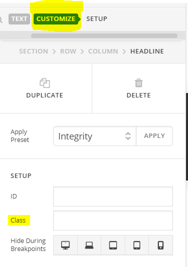
Sorry, I’m lost. I’m not sure how to give a heading a class within the Pro editor…?

Thanks,
T

Hi again,

To give heading a class, go to Customize Tab above and in Class field, add a class (see screenshot)

Cheers!

@Nabeel - Got it! …and it’s working now! Thank you so much! :grin:

T

On behalf of my colleague, you’re welcome. Cheers! :slight_smile:

This topic was automatically closed 10 days after the last reply. New replies are no longer allowed.