Integrity Collapsed Menu on Mobile Device Not Correct

I need some assistance with the collapsed menu for small screen sizes. Three things:

  • Image on left needs to be left justified.
  • Need Middle Image to be in center
  • Need “hamburger” to be squared, right now it is squished and rectangular on device, but not in Cornerstone.

Website: ShabbatDate.org

Thank you.

Hi @mfksdk7,

Thanks for writing to us,

You can set your requirements using the builder. Please follow the following steps.

First of all, hide all existing bar for smaller devices.

Then add a new bar and add two containers inside it and hide it for larger devices.

Add the logo in the first one and Navigation dropdown element in the second one.

Now make the Navigation dropdown right align from second container settings.

Please check screenshots.
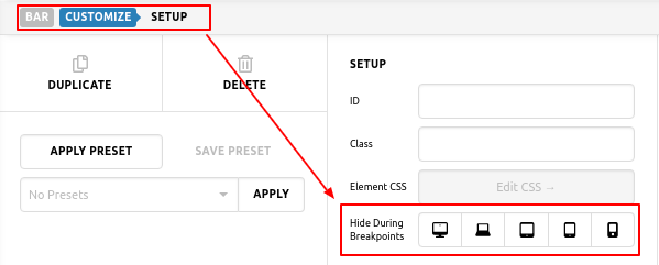


copy-header-Headers-Pro (2)

I checked the site, You added width and height 38px and 33px respectively. Kindly add same height and width to show the hamburger square

Hope it helps you.
Thanks

PrakshaS, thank you very much. That helped me understand the menu a lot and now all sizes look excellent. Great advice and much appreciated.

Glad that we could be of help.

Cheers!

This topic was automatically closed 10 days after the last reply. New replies are no longer allowed.