Inline header width issue

Hi,

How can I adjust my nav and logo (set as inline) so that it fits on one line when viewed on a desktop?
I added this css earlier but then I added one more tab and it jumped to two lines, I tried adjust the width in css but nothing happened. Thanks in advance!

Code: .x-navbar-inner .x-container.max {
max-width: 1600px;
}
.x-navbar-inner .x-container.max,
.x-topbar-inner.x-container {
max-width: 1600px;
}

Screenshot:

Hello @AdrienMDesign,

Thanks for asking. :slight_smile:

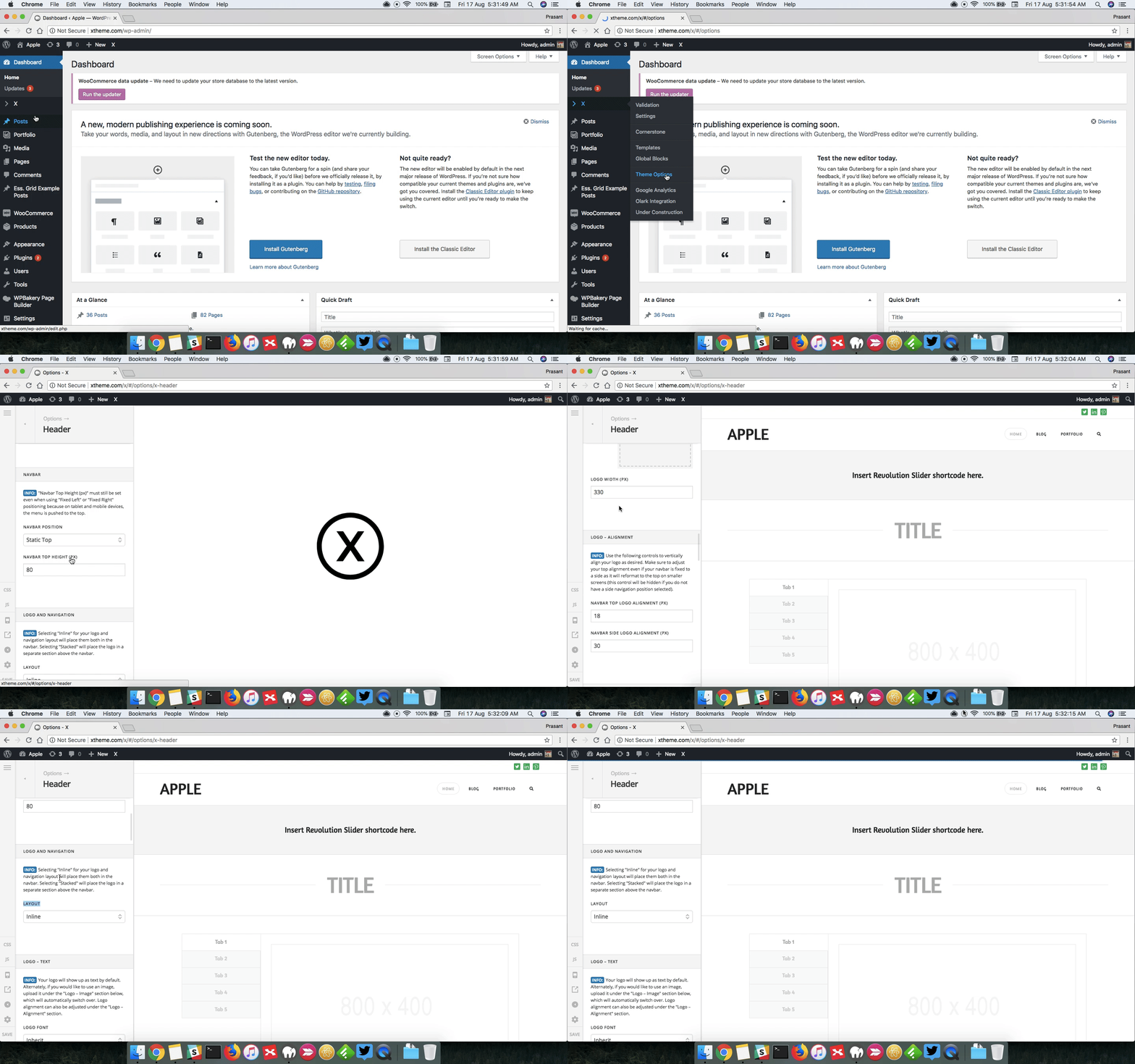
There is no need to use custom CSS to have inline navigation. Under X > Theme Options > Header > Logo and Navigation > Layout and select Inline. Here is a recorded screencast that you can take a look.

Thanks.

Hello,

Thanks but I already did this but the logo still appears over the menu. On a wide screen it looks fine but on a “standard” desktop it does not. It seems like I need to make the container wider so the menu items and logo fit on one line.

Hi @AdrienMDesign,

It’s because of 72% width that you applied in the layout width (Theme Options > Layout and Design). In your screenshot, your desktop has width of 1200px and 72% of that is about 864px (smaller than tablet since tablet is 1024px).

It working on the standard desktop but your allotted width is a bit small compared to standard desktop actual width.

I recommend increasing the width of about 90%, then set the max-width to 1200px (equal to your screen) instead of current 1600px.

Thanks!

Makes sense, thank you!

You’re welcome.
If you need anything else we can help you with, don’t hesitate to open another thread.

This topic was automatically closed 10 days after the last reply. New replies are no longer allowed.