I find that when on a smaller screen (say a small laptop), the inline header becomes stacked yet there is still room for it. Please see the attachment, it will explain it well. How do I prevent that? I have tried this but it is only padding, I think the menu is padding too much on the left.
.x-navbar {
padding-top: 15px;
padding-bottom: 15px;
}

Hello @ckwright,
Thanks for writing in!
Actually this is not an issue. It is quite normal for the menu to move down to the next line because there aren’t enough display to display both the logo and your menu. I’ve taken a closer look at your logo image and I found out that you have a 450x80 image.
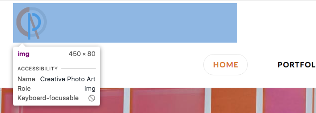
As it turns out, there is a text in your logo:

You may need to reduce your logo or at least display a smaller version of it.
Hope this explains it briefly.
Thanks so much. Yep, it was my issues LOL. I forgot about that text, that explains it!
Glad we could help,
Cheers!
This topic was automatically closed 10 days after the last reply. New replies are no longer allowed.