Index Page Image

Hello - I am trying to make the image at the top of the page reactive so it shrinks to the screen when it is pulled up on mobile. Right now, the image is still giant and pixelated when I pull it up on mobile. How can I adjust the top image with the man looking up at the stars to be reactive and proportionate to the mobile screen? Any insight is appreciated.

http://www.humanityfest.org/

Thank you,
Bryan

Hi Bryan,

Thanks for writing in! Before anything else, I noticed that you are using an older version of the theme (5.1.1) and Cornerstone (2.0.6. Please be advised that we have released X 6.4.6 and Cornerstone 3.4.6. It is now available in automatic updates. You can now update to this latest version first. This latest release contains fixes for several issues so be sure to check out the changelog (http://theme.co/changelog/).

After doing the updates, always remember to clear all caches (if you are using WP Rocket, WP SuperCache or W3 Total Cache) when updating so that the code from the latest release is always in use. This will help you to avoid any potential errors.)

And to resolve your issue, please make use of the v2 section element instead. You have more better control in handling the background image. What you have in mind will require you to disable the parallax effect so that the image will always be position at the bottom of the section showing the man. If in case, you do not see the v2 section, please go to X > Settings > Permissions > Macros and enable all V2 elements. And also make sure that the advance mode is enabled in X > Settings > Permissions > User Preferences > Advanced Mode

Hope this helps. Please let us know how it goes.

Great, thank you. I updated the theme and cornerstone, enabled all V2 elements, and enabled the advanced mode. I turned off parallax, but not sure what else to do to make sure the image shows up fully in mobile mode. Can you offer a little more insight on how to address this? Thank you!

Hello Bryan,

You will need to recreate section and use the v2 section so that you will have this background image settings:
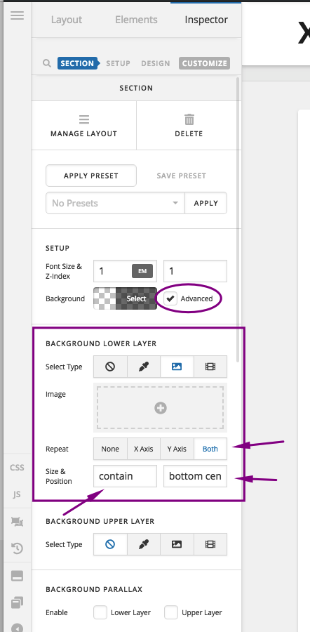
And by the way, I would like you to try this demo here: https://davidwalsh.name/demo/background-size.html which would explain how background image works.

We use the background-image: cover; which would cover the whole area of the container. This is responsive enough which will always covers the whole area. The only thing to consider here is that if your image size is smaller, it will be stretch out and if you have a bigger image, it will get cut off.

Yes we can use background-size: 100% 100%; which is also responsive but your image will either be stretch out or get squeezed depending on the size of the container.

Yes we can also use background-size: 100% auto; but then as soon as you resize your browser or on smaller screen sizes, you will probably have white spaces around the image.

Or we can also use background-size: contain; but then this is not a good choice because you will see white spaces around your image.

Hope this helps.
This topic was automatically closed 10 days after the last reply. New replies are no longer allowed.