The columns on mobile are 48% of the entire width. Why are they not full width on the mobile? One is after the other as it should be.
https://newacquirefire.wpengine.com
Thanks,
Krina
Hello Krina,
Thanks for posting in! You are having this issue because you have added these custom css:
@media (max-width:767px) .x-column.x-sm{
    width:100% !important;
}
This code is not valid. Please remove this.
And also, you added this:
.x-section{
    position:relative;
    margin:0 0 1.313em;
    padding:25px 0;
}
.x-column{
    position:relative;
    z-index:1;
    float:left;
    margin-right:4%;
    padding:20px !important;
}
.x-column.x-1-2{
    width:48%;
    box-shadow:orange;
    border-bottom:3px solid #FFE989 !important;
    border-right:3px solid #FFE989 !important;
}
Please have it updated and use this code instead:
.x-section{
    position:relative;
    margin:0 0 1.313em;
    padding:25px 0;
}

.x-column{
    padding:20px !important;
}

.x-column.x-1-2{
    box-shadow:orange;
    border-bottom:3px solid #FFE989 !important;
    border-right:3px solid #FFE989 !important;
}
Please do not add any width property or modify the widths of all the columns to prevent any further issues.
I have done what you recommended and the column on mobile is only half way across.
Thanks
Hello Krina,
I have checked your page source and I am still seeing the width.
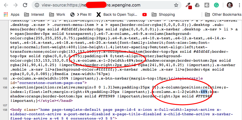
You might need to clear your plugin caches first. If nothing is working, please provide us access to the site so that we can remove the code for you and hopefully resolve your column width issues.
Thanks.
Thanks, I put it on the actual cornerstone page as well. it is working fine now.
Krina
You are most welcome!
This topic was automatically closed 10 days after the last reply. New replies are no longer allowed.