Hello there – on my site, I have built out a section with images and text side by side – the images on my homepage are not resizing properly, and are very thin height wise. Any fix for this? The sections are the three right above the contact button at the bottom of the page Thank you!
Hi There,
Please add the following code under X > Theme Options > CSS:
@media (max-width: 480px){
.column-height {
min-height: 300px;
}
}
After that add the column-height class to your column contains the background image.
Let us know how it goes!
Thank you - that worked for the first image, but not the other two.
Hi again,
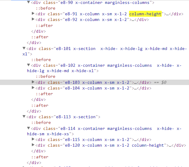
I checked your page and I see you’ve not added the column-height to the other two columns (see screenshot) please add the class to all of your columns that has the background image.
Cheers!
Thanks, that fixed it for mobile (iPhone 6s and smaller), however it is not resizing correctly on my tablet. Any suggestions?
Hi there,
The target device in your CSS is just for mobile,
@media (max-width: 480px){
.column-height {
min-height: 300px;
}
}
You can add more if you prefer with a different height, like this
@media (max-width: 979px){
.column-height {
min-height: 200px;
}
}
Hope this helps.
This topic was automatically closed 10 days after the last reply. New replies are no longer allowed.