Images on my “how to use” page do not wrap on mobile versions. they’re compressed together so you cant see the full images.
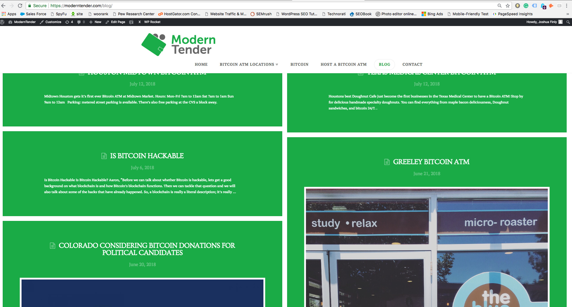
Also, the top posts on the blog page are covered slightly by the header.
Images on my “how to use” page do not wrap on mobile versions. they’re compressed together so you cant see the full images.
Also, the top posts on the blog page are covered slightly by the header.
Hello @ModernTender,
Thanks for asking. 
I can see that image is not resizing on mobile menu on your website. To fix that please remove the width (currently 400px) property you have set to auto in image element. Here is a screenshot.

In blog page I don’t see issues with the layout. Can you please share a screenshot?

Thanks.
Hi Joshua,
Could you please try adding the following CSS rule into your X -> Theme Options -> CSS area and see if that helps.
@media(min-width:1000px){
  .blog .x-main.full {
    margin-top: 125px;
  }
}
Hope that helps.
Success, thank you!
You are most welcome.
This topic was automatically closed 10 days after the last reply. New replies are no longer allowed.