Images and paralax not adopting to different screens

Hi.

I’m working on my website runelacroix.dk, only editing in cornerstone, and have to questions at the moment.

  1. Paralax functions doesn’t work on my smartphone, why?
  2. On my own pc using chrome, the images (like on my page “terapi” and “rune”) rescales by themselves, to fit the design. But on my Work computer, using internet Explorer, the Pictures seems to keep their original scaling, messing up the whole desing. What to do about this?

Best regards, Rune
Hey Rune,

Thanks for writing in.

  1. Parallax is purposely disabled in mobile for performance reasons.

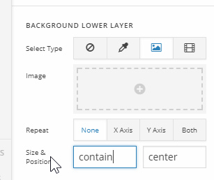
  2. I’m sorry but I’m not sure what is your setup here so I could not give a specific answer. If you’re using your image as a background then this would be the case. The background image covers the section out of the box and the section’s width and height varies depending on screen size. With that said, you should expect that part of your background image will be hidden. Otherwise if you set it to contain, you will get an empty space above or below your image depending on the image ratio.

If you want all parts of your image to display, you should use an image element.

If your setup is different, please give us the URL of the page you’re having an issue with so we could give you a specific answer.

Thanks.

Hi.

I don’t use the images as background but image elements, and they seem to adjust proberly to most screens. It’s runelacroix.dk.

Can I activate paralax for smartphone also?

Hi there,

It’s turn off in the core script and the only way to activate it on mobile is re-coding it which isn’t possible since the core scripts are pre-compiled.

As for images, please add this CSS to your global custom CSS.

@media all and (-ms-high-contrast:none) { 
*::-ms-backdrop, .x-image img, .x-image {width: 100%; } 
}

Thanks!

This topic was automatically closed 10 days after the last reply. New replies are no longer allowed.